MyDiya
Summary
Diya Health is a health startup connecting patients, families, and doctors through their telemedicine apps. As a product design intern, I worked on their electronic health diary web-app MyDiya that allows patients to record their medical history and daily changes in health. Working with a group of three other designers, we were tasked with redesigning MyDiya to be more usable for patients.
New users have difficulty using the MyDiya app.
The MyDiya app has extensive telehealth capabilities like being able to record one's vitals, import health records, and track symptoms. However, the CEO informed us that users struggled to use these capabilities, either because too much information was displayed or it was hard to navigate to that information.
How might we redesign the app to be more usable?
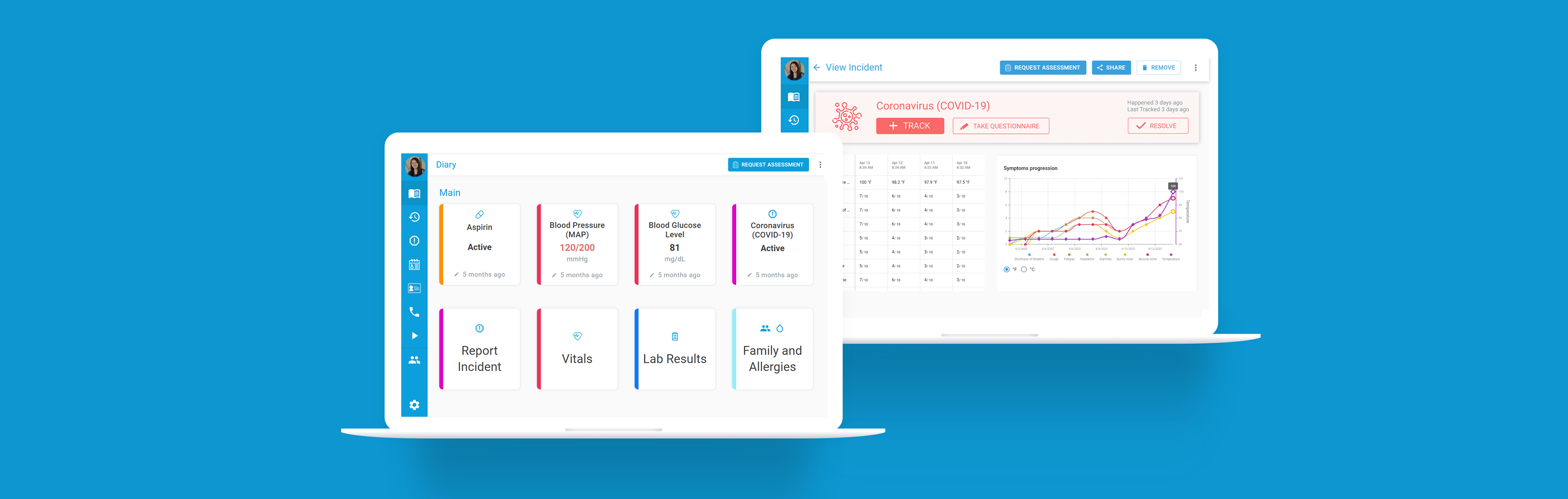
View and manage all aspects of your health with ease.
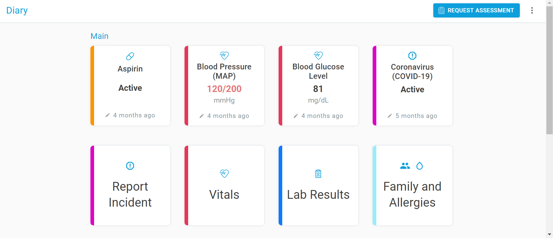
The home page now displays all health features as color-coded cards. With a quick glance, you can view a summary of your health, and updating your health is as simple as clicking the desired card. Comprehensive, yet simple.
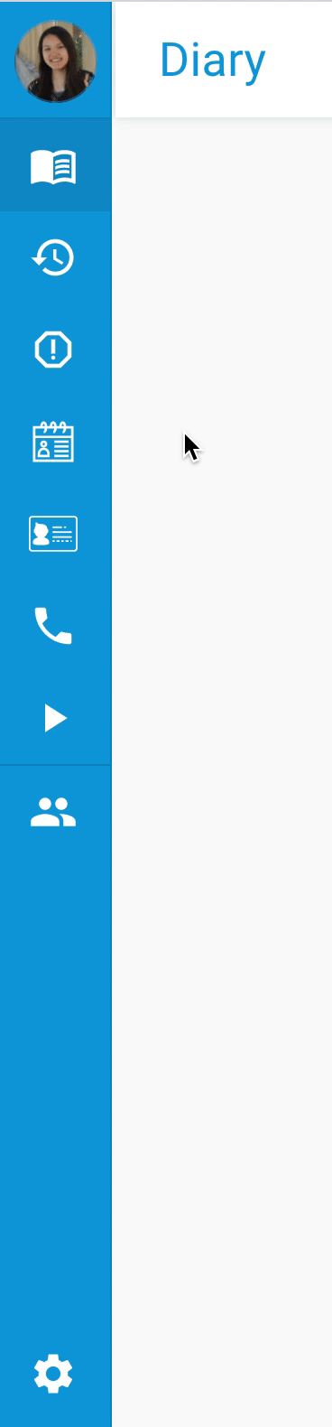
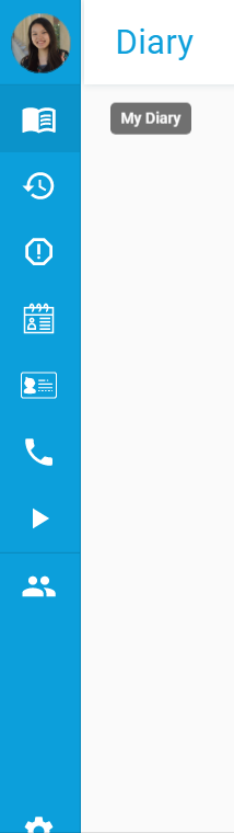
Simple, intuitive navigation.
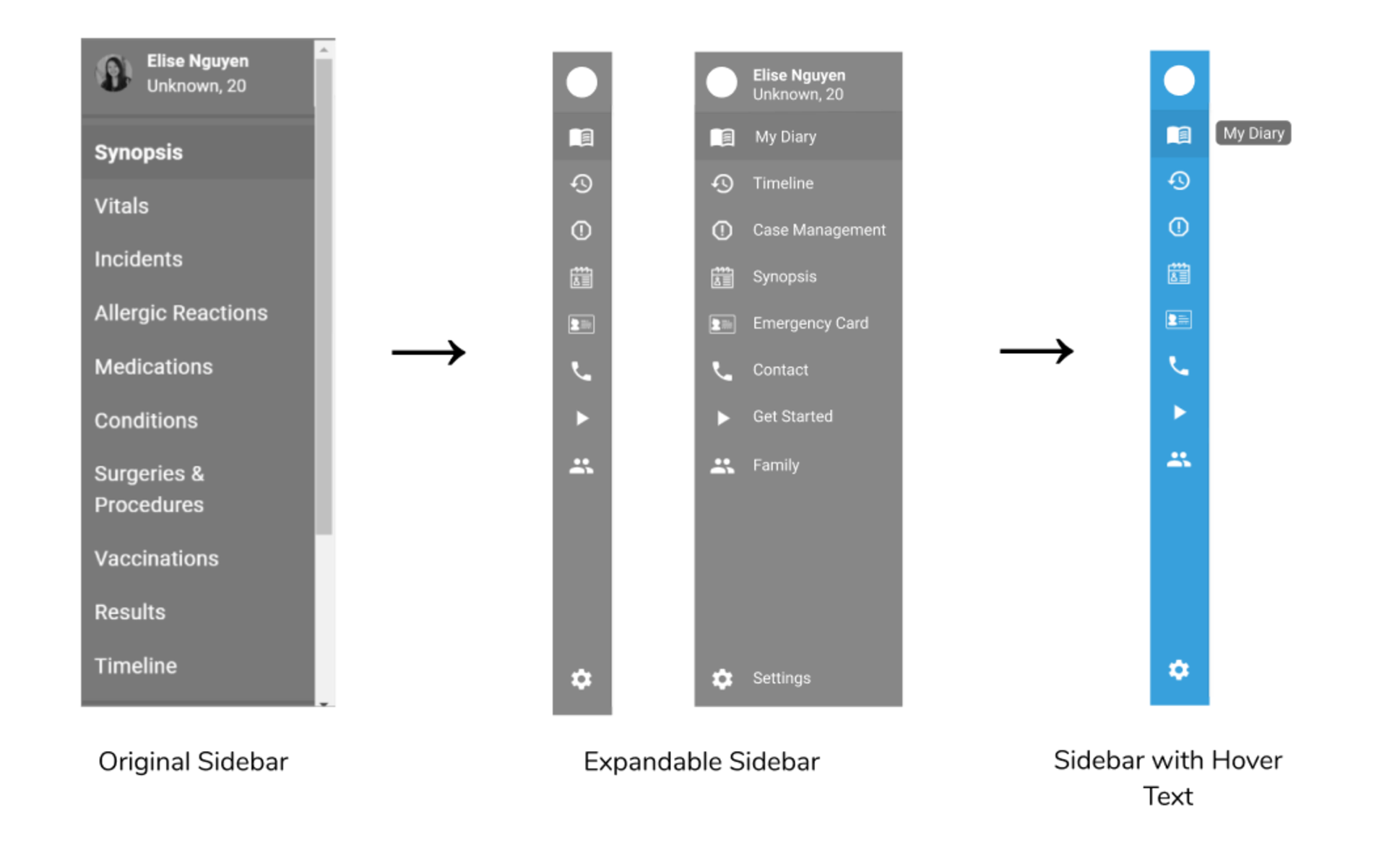
The left sidebar contains 8 less icons in the new redesign, reducing the cognitive load on the user. It also contains icons better representing its purpose. Furthermore, instead of icons' accompanying text always displaying, icon text only displays when the user hovers over the icon for more information. This gives more space for main content on the right-hand side.
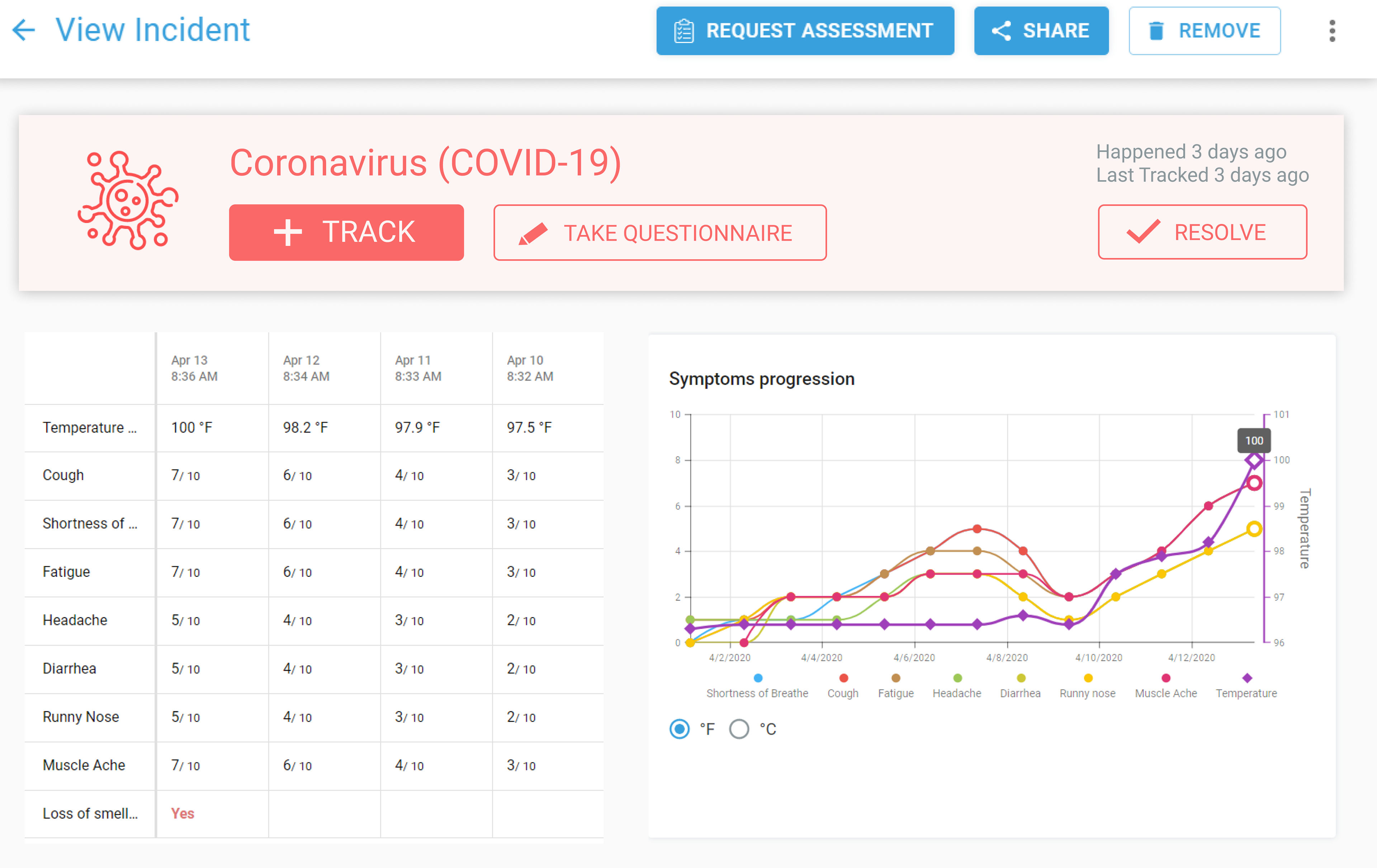
Easily track COVID-19 symptoms over time.
A light red COVID-19 card displays at the top of the COVID-19 Symptom Tracker page, encouraging and making it easier for users to track their COVID-19 symptoms through the large call to action buttons on the card.
A redesign that puts patients' health in their own hands.
Through making it easier to manage health information and track one's COVID-19 symptoms, we enable patients to get better diagnoses and improve their own health.
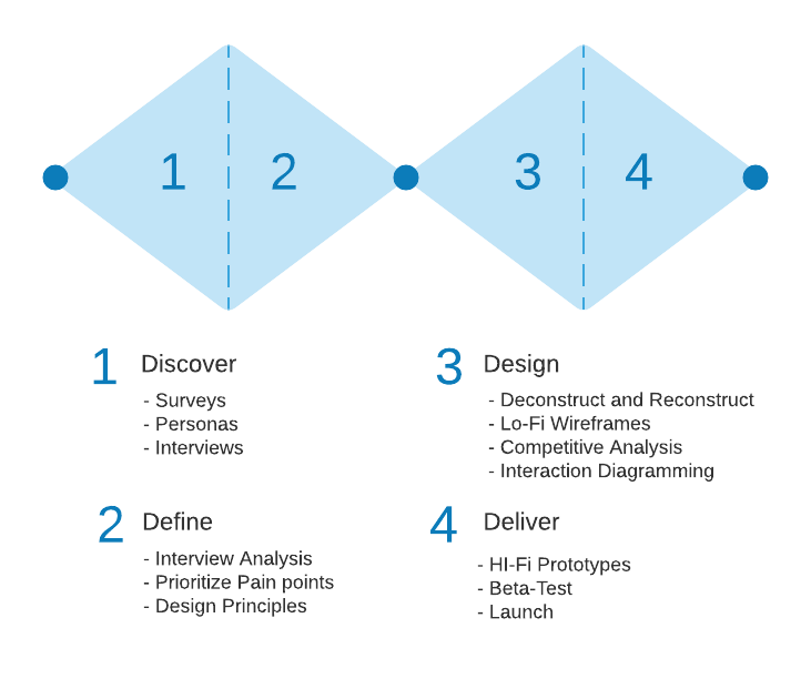
Double diamond-ing.
We followed a double diamond process of convergent and divergent thinking to structure our design process.
Surveying our target audience: new users.
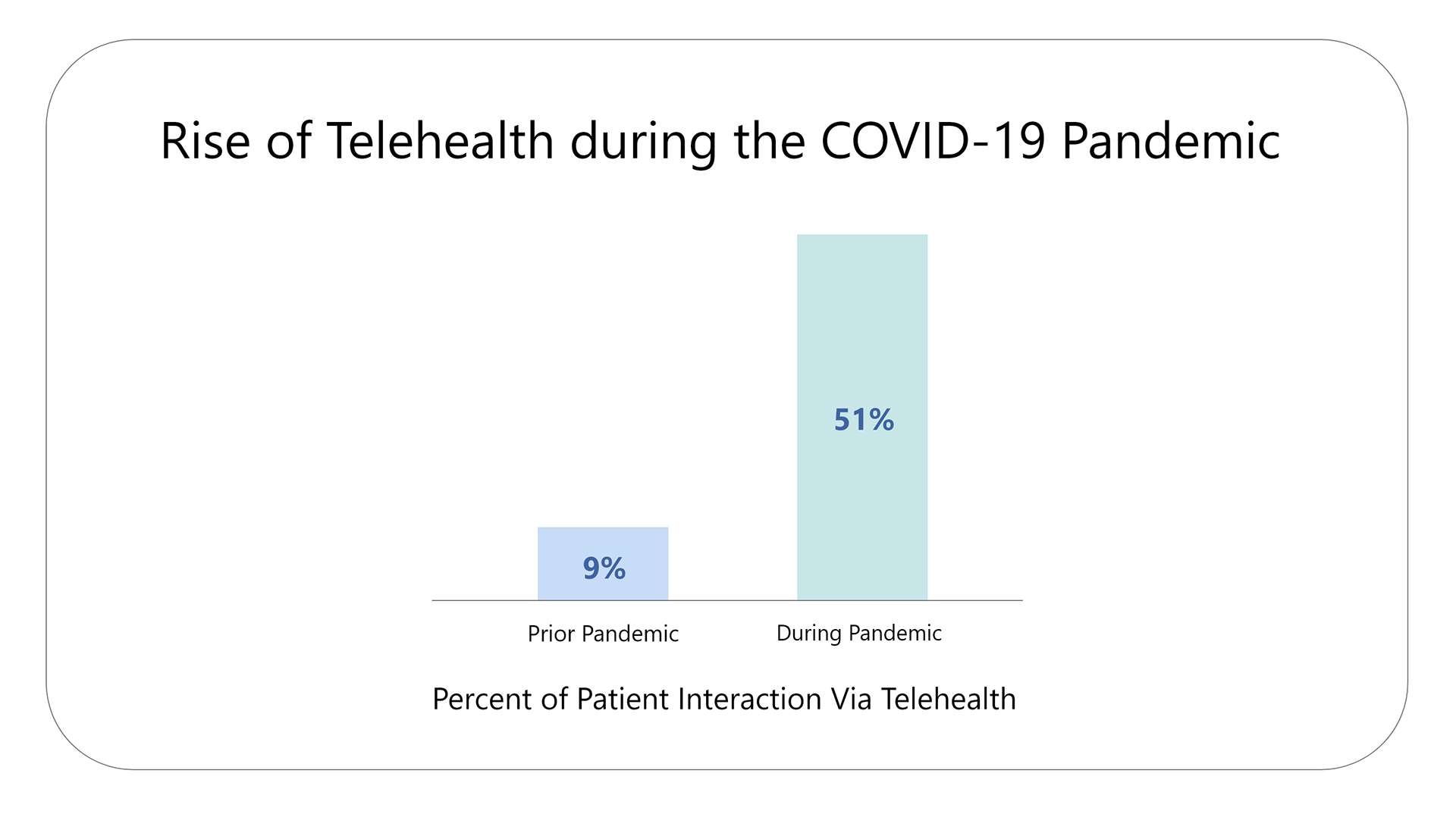
DiyaHealth anticipated and began marketing to new users during the COVID-19 pandemic when a telemedicine app like MyDiya is needed most. It was crucial to offer usable, free, and remote healthcare, as in-person doctor appointments were not safe and health disparities were worsening. A survey of about 300 practitioners (oncologists, specialists, and primary care) further confirmed this influx of new users during the pandemic.
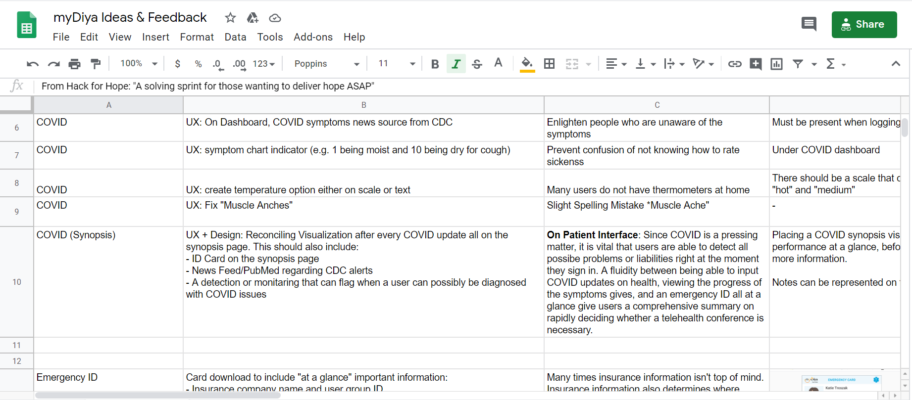
Since the goal of our redesign was to attract and retain users during the pandemic, we surveyed 32 first-time users with the help of our team's product manager. Our intention with the survey was to understand how users interact with the app and what, if any, features needed to be improved to make the app more useful to users. We kept track of users' first impressions, pain points, and expectations in a Google spreadsheet.
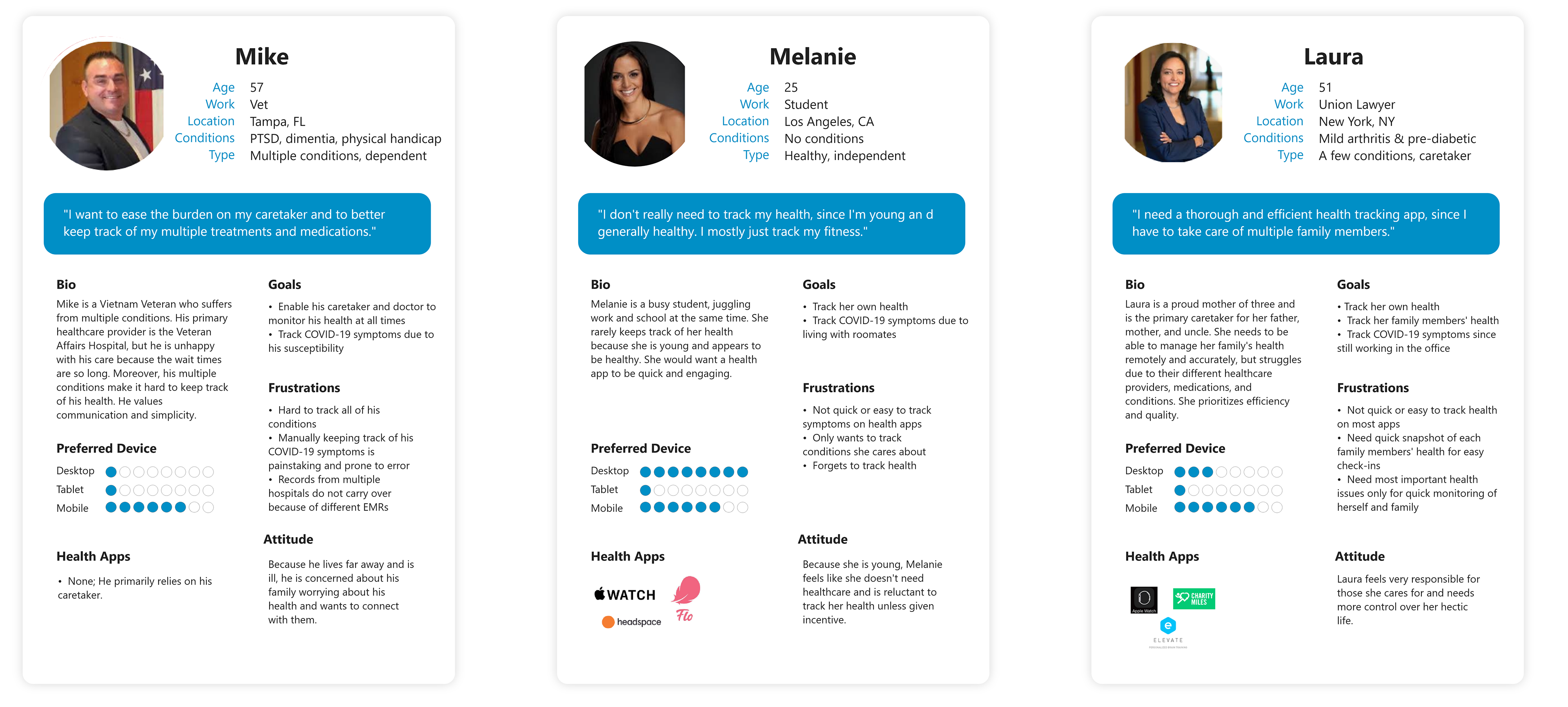
Using personas to further understand our diverse users.
Patients' health conditions are diverse from being old to young or having multiple diseases or none. In line with DiyaHealth's mission to democratize health, we wanted to ensure our redesign would target all types of users. We worked with the health professionals on our team to create diverse personas with various health conditions, ages, and backgrounds (all of which affect how a user might interact with the app).
Key insights
- Users find the language hard to understand.
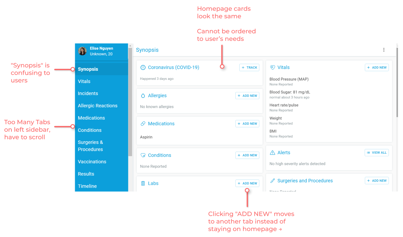
The homepage was titled "Synopsis," which did not indicate that users could input and view their health information there. The language was too clinical and verbose."I was confused by what [synopsis] meant, and I think other non-physician users would also be confused."
- Users' health stories are diverse.
From the personas we created, it was clear that each patient has a unique health story, affected by many factors like their age, gender, family history, and line of work. - Users find the navigation not intuitive.
Certain pages were hidden until configured in the settings and users were often redirected to pages they did not expect."I was super confused when I first registered because I couldn't see the Medication tab because I didn't think to click on my name to go to the setting and then to update the feature visibility. It just wasn't super intuitive."
- Users are overwhelmed by the amount of information presented.
On the homepage and COVID-19 symptom tracker, a lot of information is displayed and users were confused on what action to take or where to look. Moreover, there were 13+ tabs on the left navigation bar and users rarely explored all of them, leaving many important features unused."The number of tabs on the left sidebar feels overwhelming. Plus, having to scroll makes navigating harder."
What parts of the app should we redesign?
Our user research and insights helped us understand why and what parts of the app were not usable. Through tagging each user feedback with the associated area of the app, we visualized which sections of the app garnered the most feedback from users through the pie chart below.
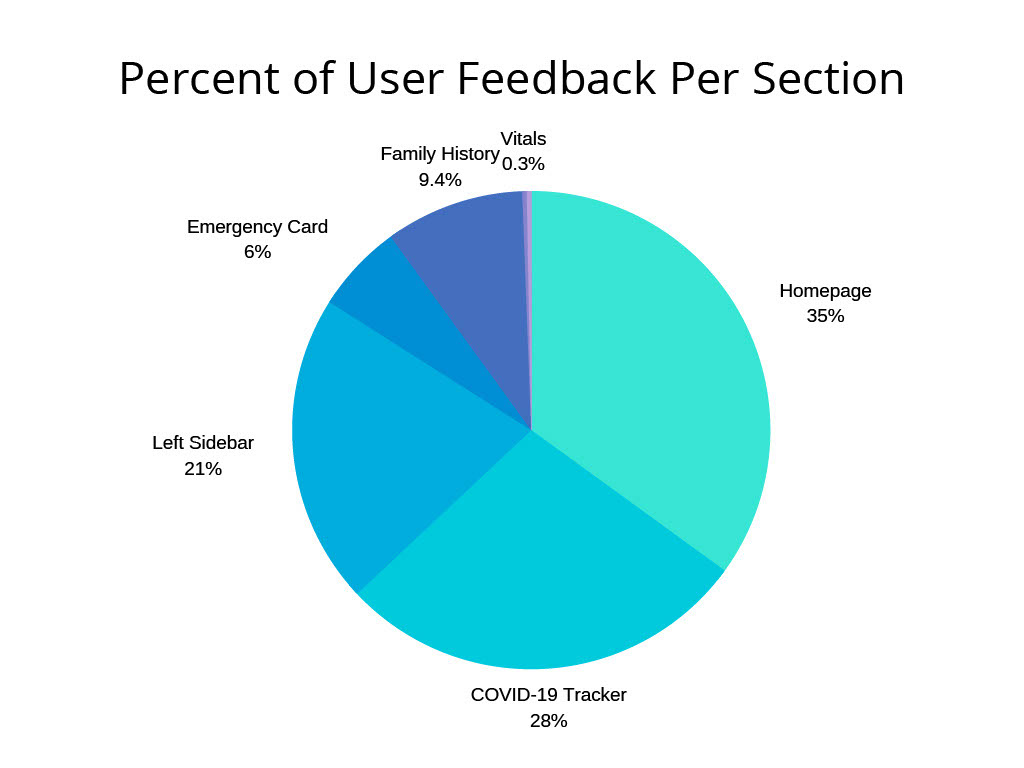
Since the Homepage, COVID-19 Symptom Tracker, and Left Navigation Sidebar garnered the most comments and concerns from users, we focused our redesign on these areas.
Pain points.
Homepage & Left Navigation Bar
COVID-19 Symptom Tracker
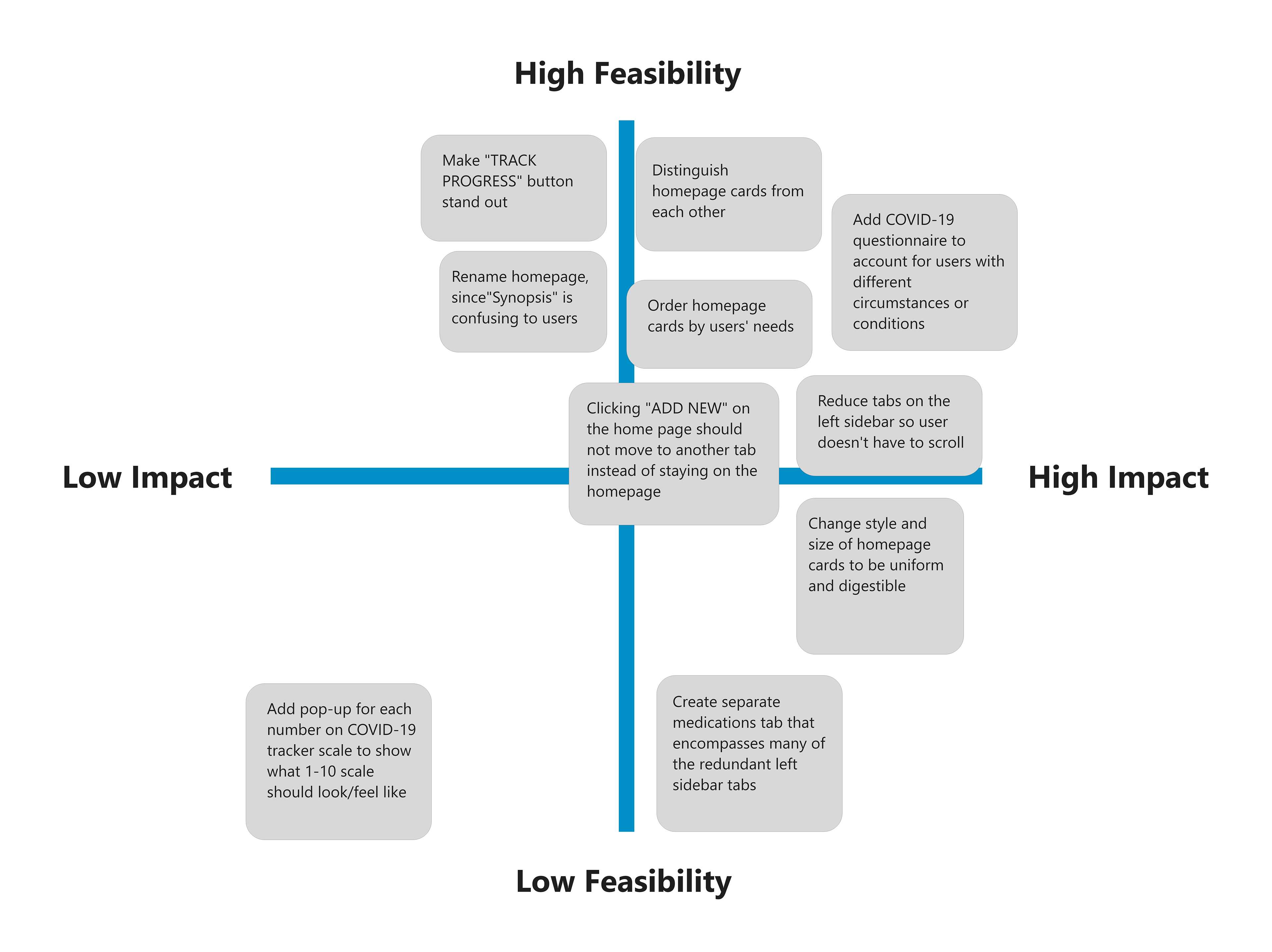
Ideate and prioritize solutions.
We ideated on possible solutions to the above pain points and used a feasibility matrix to decide which solutions we were going to address in our redesign.
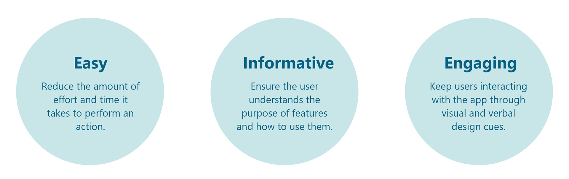
Design principles.
We extracted three design principles to help us evaluate our design decisions and ensure we are aligned with user and business goals.
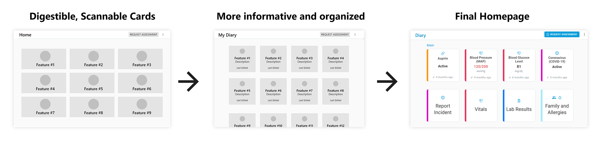
Improving card interface so users can view and edit their health more easily.
Based on our user survey, we knew that users were overwhelmed by the amount of information displayed on the homepage and unsure of where to click. Our first redesign focused on making cards easy to scan. On the second iteration, we collaborated with healthcare professionals on our team to make the homepage more informative for users' daily health. Our last iteration added colors and animations to make the design engaging and to best utilize cards to organize the health features.
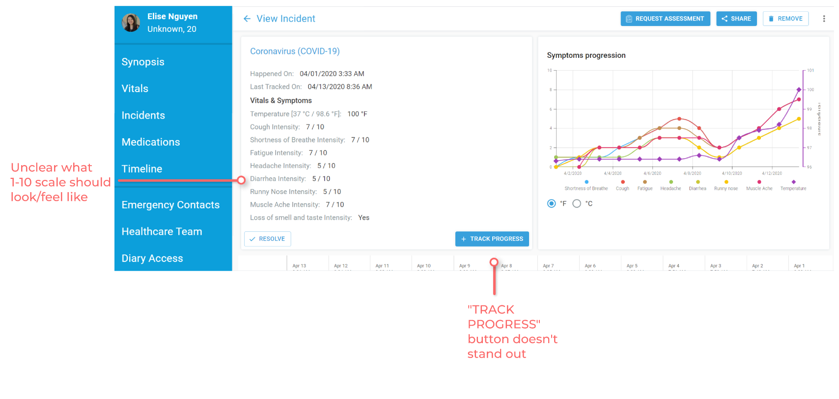
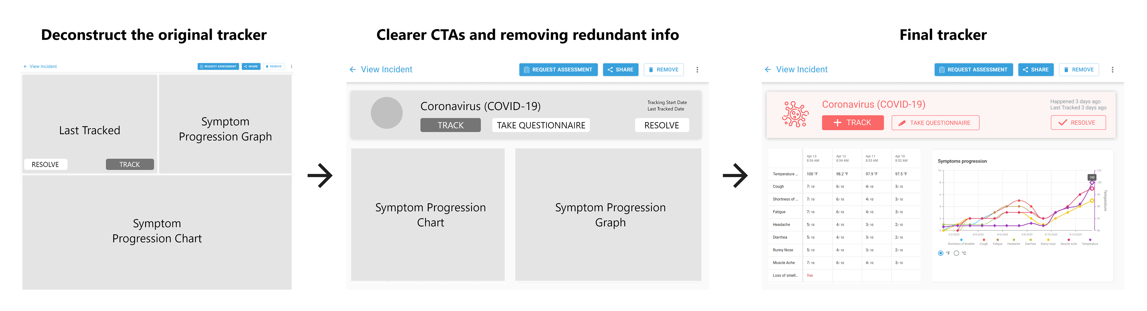
Designing a symptom tracker that users can better understand and utilize.
Users expressed confusion with the tracker page's elements and unclear call to actions in the initial user survey. To redesign the tracker, we first consulted Diya Health's CEO and engineers to fully deconstruct and understand all the page's elements. This helped us better convey the true purposes of all the tracker's elements. With each iteration, we reorganized the tracker's information to be clearer to users. After showing these to our team and users for feedback, we added final touches like color to make a high fidelity wireframe.
Helping users navigate the site more easily.
Users found the navigation not intuitive as certain pages were hidden until configured in users' settings and users were often redirected to pages they did not expect. As we were designing a solution, we asked ourselves a key question:

We chose to simplify the navigation, rather than teach users to use a more complicated interface. Though this takes more design and development work, it ultimately saves users the most time. When in doubt, put users first. To simplify the navigation, we redesigned the navigation flow using interaction diagrams and removed the features visibility feature, opting to make all features visible on the homepage and not at all visible on the left navigation bar. This reduced the number of tabs on the left sidebar by 8.
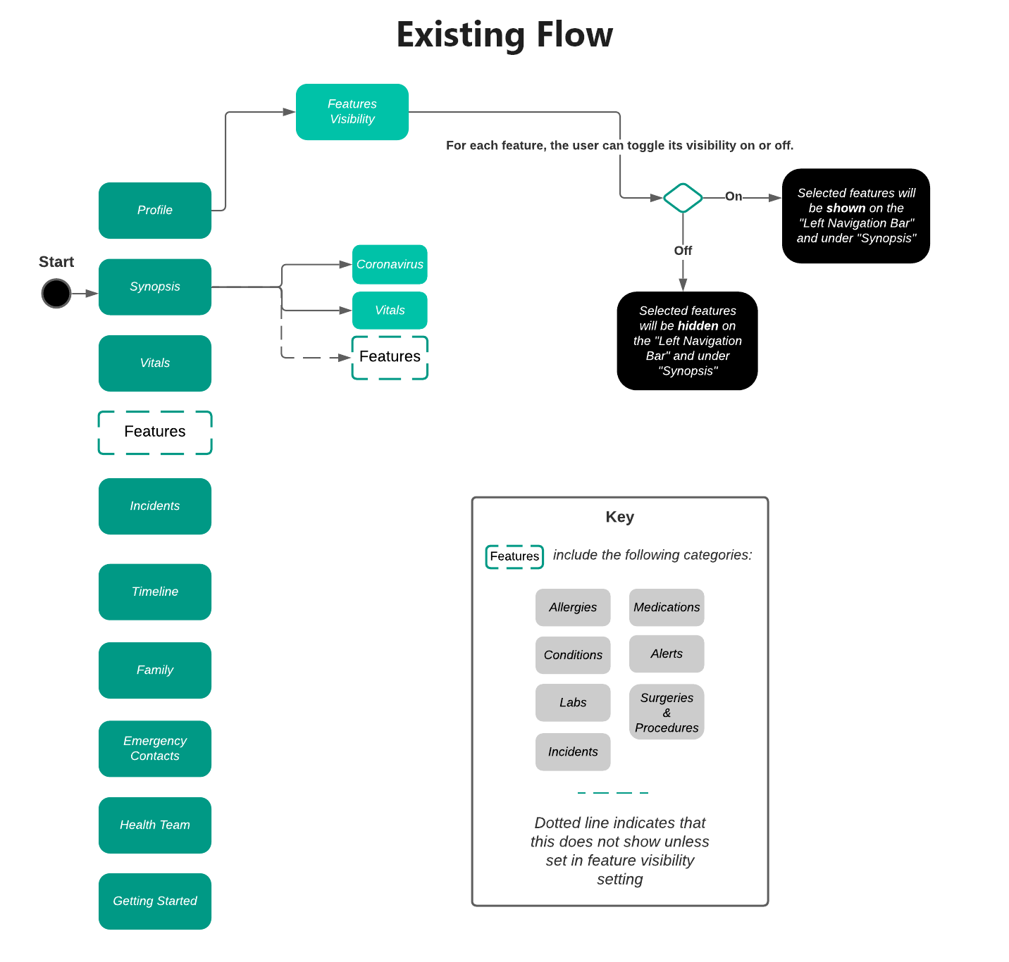
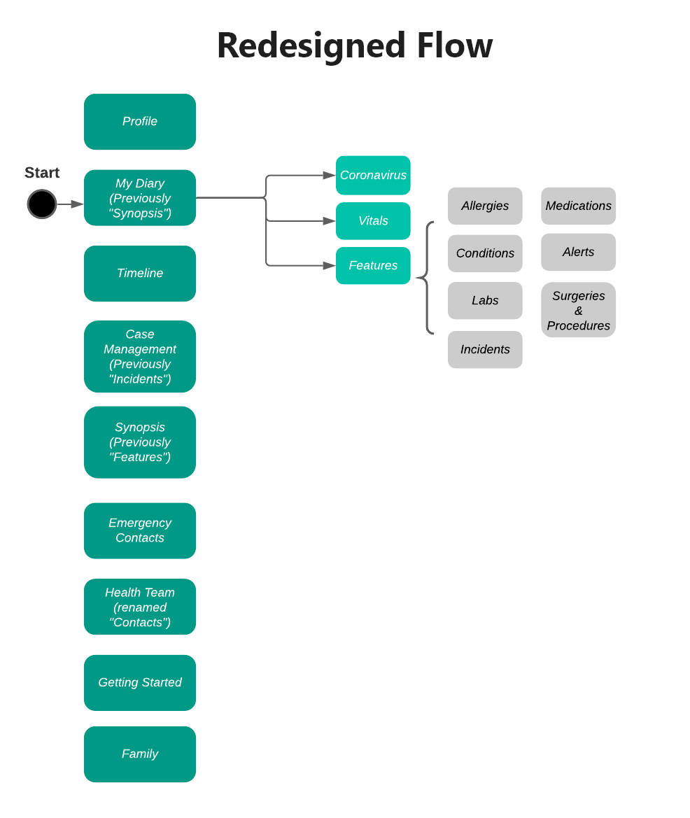
Using the redesigned flow, we created wireframes of the new navigation bar with the following changes:
- Reduced number of tabs to prevent scrolling in the sidebar.
- Hover text for each icon to display more right-side content.
- Chose new icons to better indicate each tab's purpose.
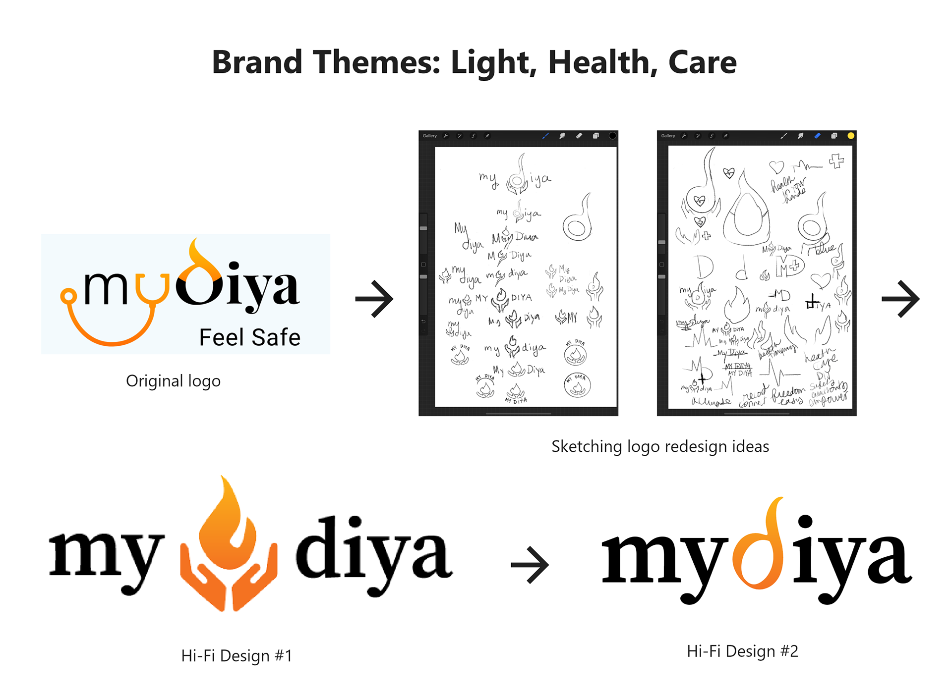
Redesigning the logo.
The CEO told us to change the stethoscope turned into the "y" in MyDiya because this design was copyrighted. Also, the "d" in MyDiya was hard to distinguish. While redesigning, we incorporated the meaning of the app's name "Diya," a word of Arabic origin that means "radiance."
A redesign that empowers patients.
View and manage all aspects of your health with ease.
The home page now displays all health features as color-coded cards. With a quick glance, you can view a summary of your health, and updating your health is as simple as clicking the desired card. Comprehensive, yet simple.
Pain point solved: Homepage was overwhelming because it displayed too much information.
Simple, intuitive navigation.
The left sidebar contains 8 less icons in the new redesign, reducing the cognitive load on the user. It also contains icons better representing its purpose. Furthermore, instead of icons' accompanying text always displaying, icon text only displays when the user hovers over the icon for more information. This gives more space for main content on the right-hand side.
Pain point solved: The navigation bar was too cluttered and unintuitive to use.
Easily track COVID-19 symptoms over time.
A light red COVID-19 card displays at the top of the COVID-19 Symptom Tracker page, encouraging and making it easier for users to track their COVID-19 symptoms through the large call to action buttons on the card.
Pain point solved: The tracker lacked clear call to action and confused users with its organization of information.

What I learned.
Fast-paced, cross-team collaboration.
Working with a team of engineers, healthcare professionals, and marketers meant learning to clearly present and justify my design decisions during team meetings. Making high fidelity prototypes was key to help engineers understand how feasible our designs were compared to the deployed app. Also, working in a startup meant that I took a lot of ownership over my work and took initiative outside of my role through starting meeting notes, Zoom meetings, and Slack channels.
What to improve.
Conduct more research and continue iterating.
Unfortunately, my internship ended before I could find out the results of my redesign. I would conduct more research, measuring user metrics and KPIs like amount spent on app per day, how many users, and how many doctor referrals made to evaluate if the redesigns improved users' experience. Then, I would reiterate on these designs further. I would also address the rest of the pain points discussed in our initial user research.