MongoDB Billing
Summary
MongoDB billing alerts help customers monitor their spending by notifying them when a certain condition (i.e. their bill is over $200) is met. However, the majority of MongoDB customers do not use this feature. As a product design intern, I worked on a design proposal to surface the billing alerts feature more clearly to drive adoption of MongoDB billing alerts, empowering MongoDB customers to make smarter financial decisions.
Role
Product design intern
Timeline
3 months
Team
Individual with help from mentor and design team
Users overlook the billing alerts feature.
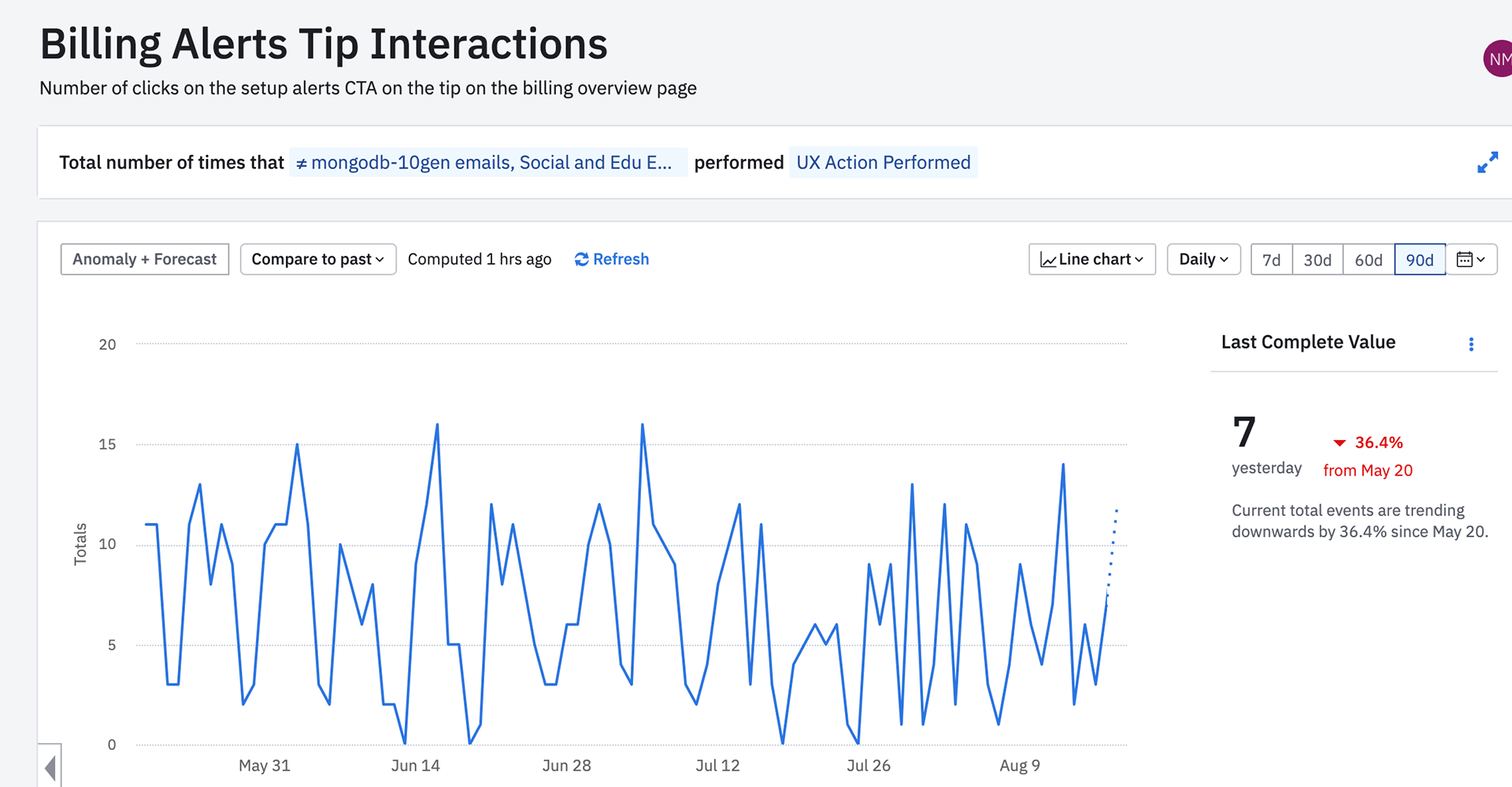
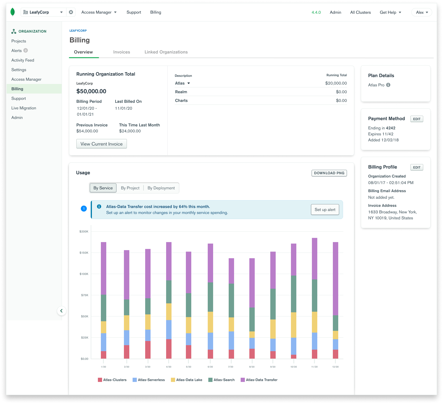
Using Amplitude analytics, we observed that only 7 customers on average click on the billing alerts call-to-action (CTA) button. Considering MongoDB has 26,800+ customers, it was clear that somehow the billing alerts CTA was being overlooked.
How might we surface the billing alerts tip more clearly?
Contextual billing alerts.
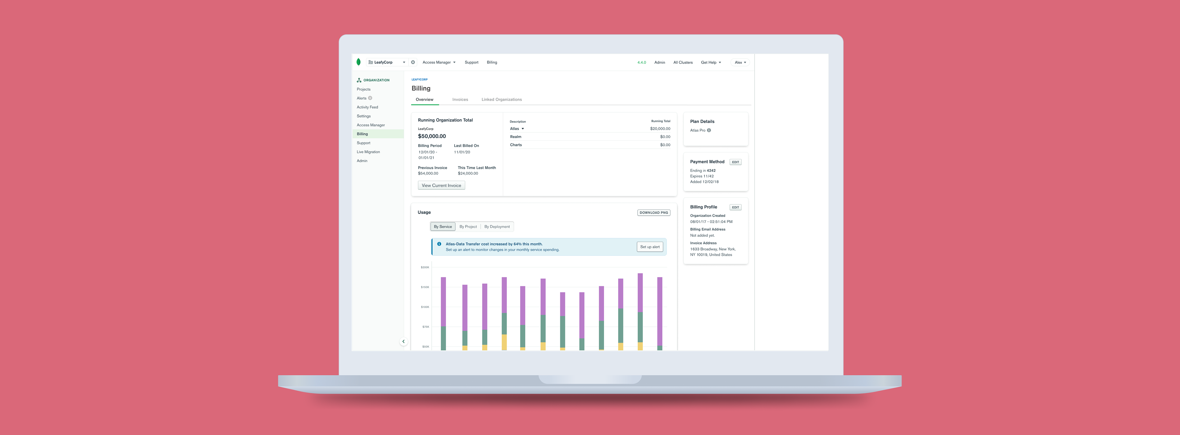
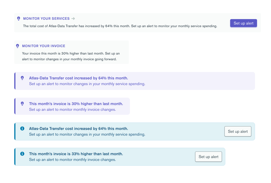
The previous billing alerts design was vague in both its visual design and messaging. In this redesign, you can see a specific alert example right where a user would find alert-worthy info. Moreover, the color, font-weight, and icons visually make this feature easier to find.

A scalable design system.
Placing alerts next to alert-worthy information meant that we had varying space to surface the billing alerts. Thus, I created a new design system that could scale based on how much visual space we might have to surface the alerts on a given page.
A redesign that allows users to be proactive about their spending.
By placing the link for setting up alerts close to alert-worthy information in the billing interface, and by designing a more friendly, eye-catching link, more users will be able to use billing alerts to proactively monitor their spending.
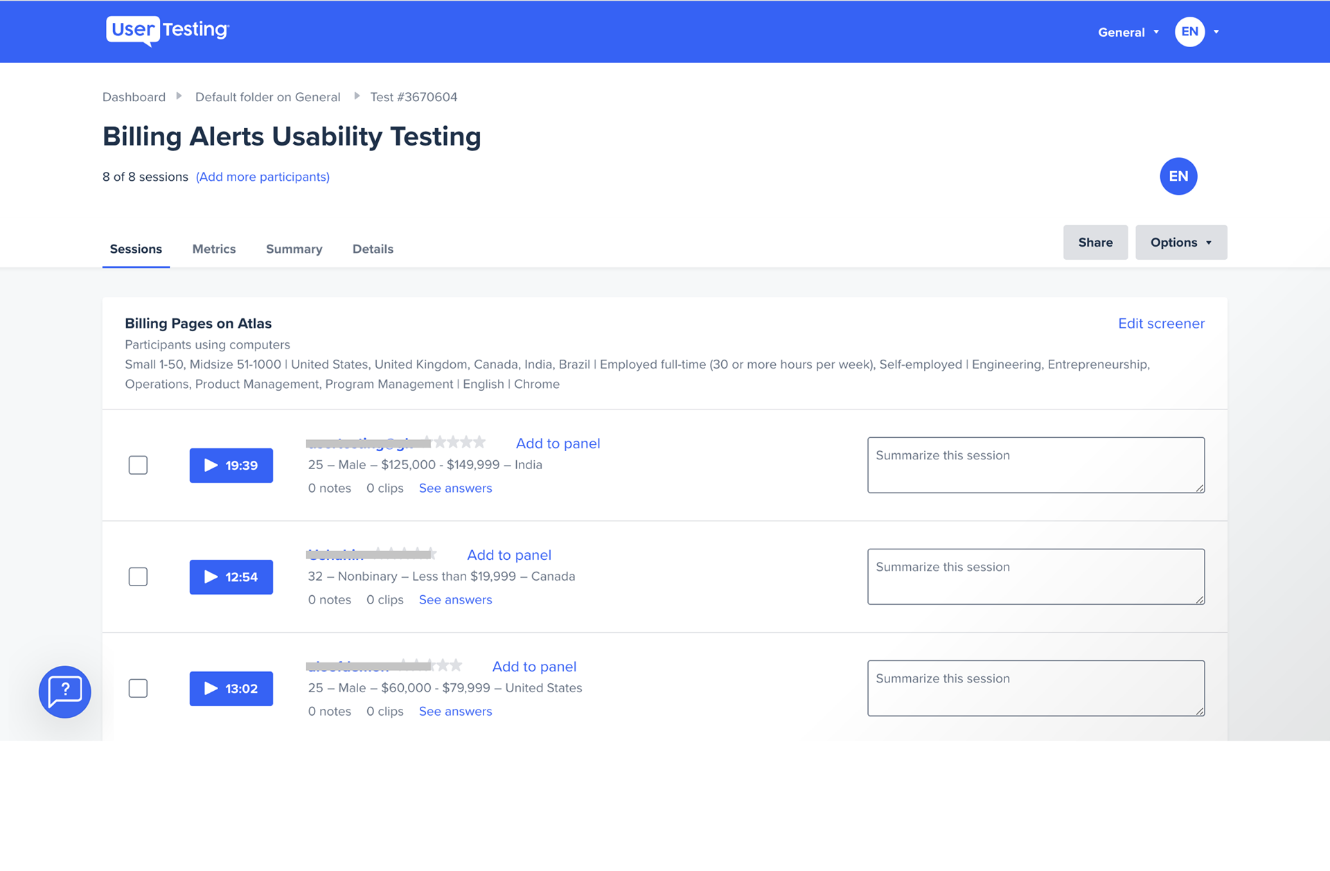
User Interviews.
The research team prepared 9 semi-structured interviews with current MongoDB Atlas users who are actively involved in Billing management and/or setting up Billing Alerts for their organization. There were two main types of users: Sales-sold and Self-serve. The former usually has long-term financial commitments to MongoDB. The latter tends to spend as they need.
1. Users want alerts to forecast a problem before it happens.
Right now, MongoDB billing alerts are focused on alerting customers when a problem has already happened. Users want to be able to fix issues before they happen.
2. Users want more fine-tuned control over their spending.
Users can be in charge of many organizations, and many projects within those organizations. They want a way to monitor these different projects without having to constantly check each individual project and organization bill.
How might we enable users to make proactive, instead of reactive, decisions about their spending?
Give more context.
A tip is only as useful as where it's placed - if a user sees a tip to set up an alert placed next to alert-worthy information (i.e. large changes in spending), they can set up an alert exactly when they need to.
Create a visual design that stands out.
Through user research, we found that users had a hard time finding the billing alerts tip card because it "looks the same as all the other cards on the page." Thus, to prompt users to set up alerts, we'll need to create a visual design that catches users' eye without distracting them from other important information on the page.
Personalize alerts.
Very few users know what billing alerts are. The majority of users want to know how billing alerts would be useful in their specific case. Our challenge is to figure out how we can dynamically show each user how billing alerts can help them be proactive about their spending.
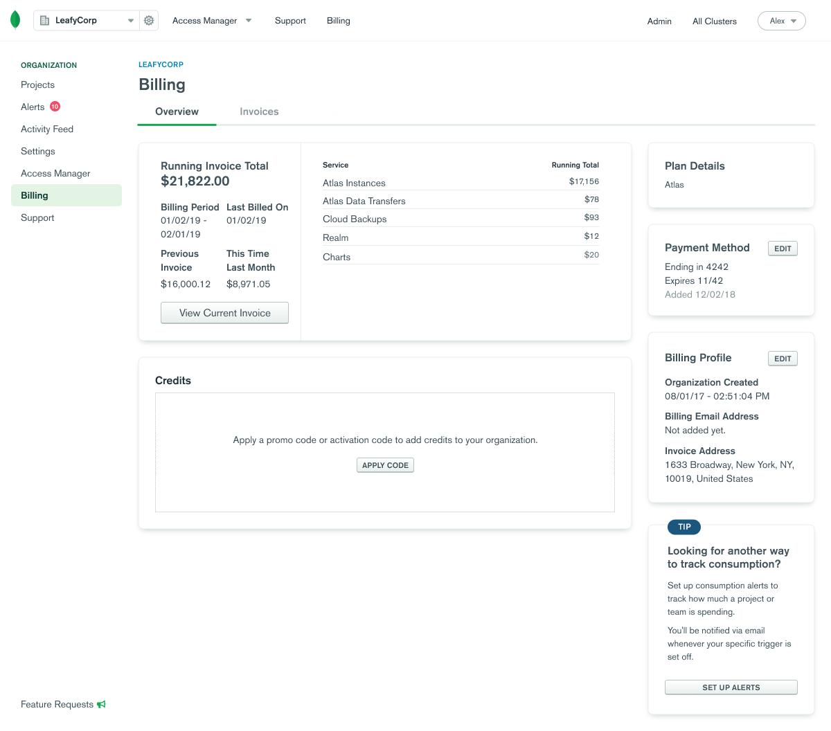
1. User clicks on the billing alerts tip.
In the previous interface, the billing alerts feature was surfaced only once in a card on the bottom, right-hand side of the page. Through Amplitude analytics and user research on Atlas billing alerts, it was clear that users were not aware of Atlas's billing alerts.
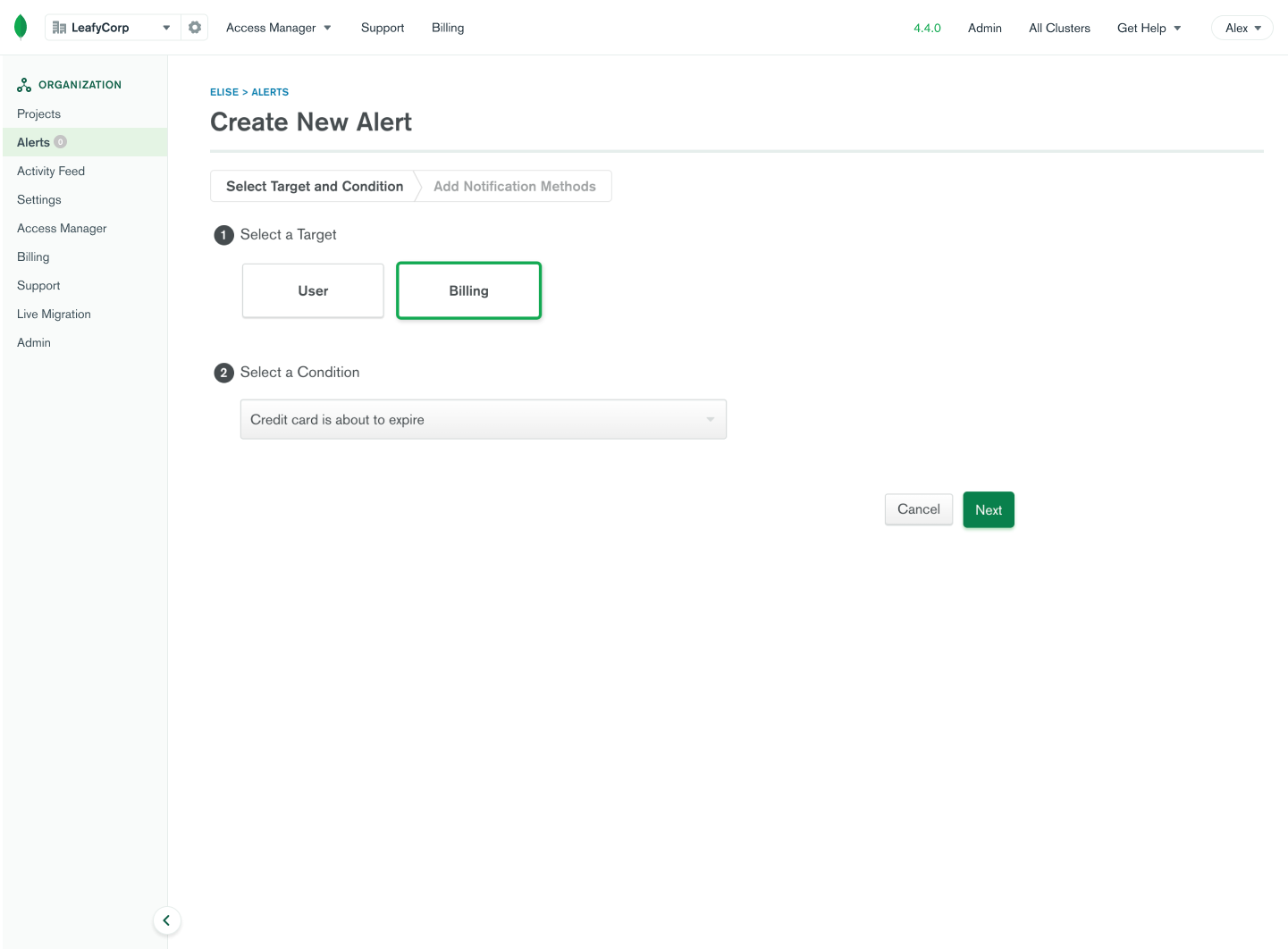
2. User selects an alert condition.
When users click on the "set up alerts" button they will be led to this screen, where they can create a new alert. The user can select a condition like "Current bill for any single project is above $200." Here, users can track how much they spend and use this information to make more informed financial decisions for their organization.
Creating a new design system.
I started by brainstorming how a basic alert could look like in a 1-hour design studio with my mentor.
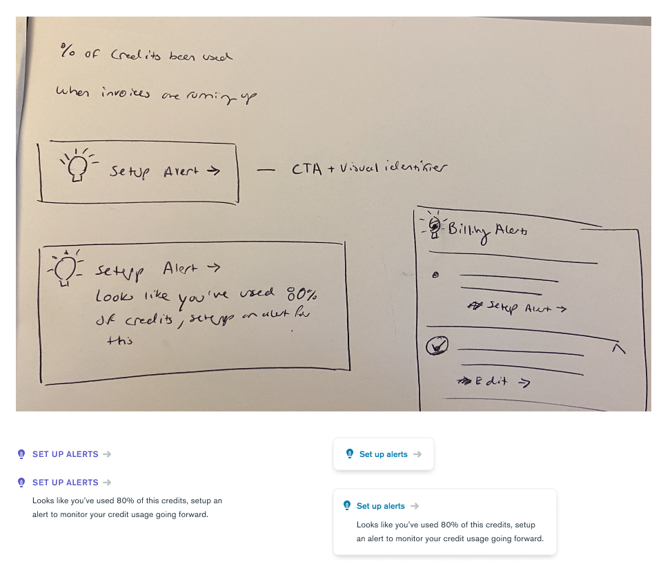
From this initial brainstorm and through conducting a competitive audit of tips, I came up with a few possible tip designs:
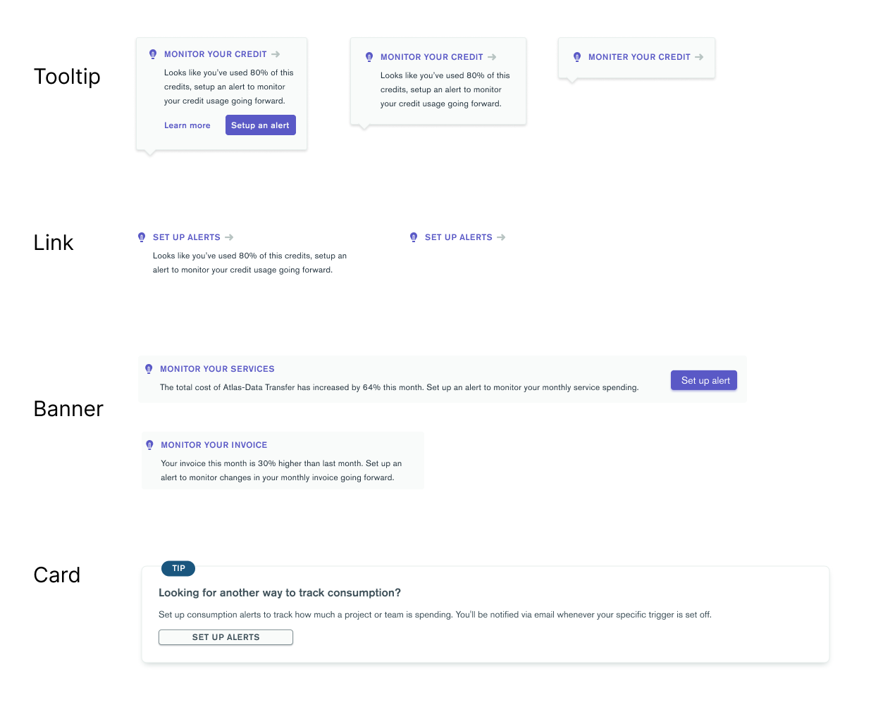
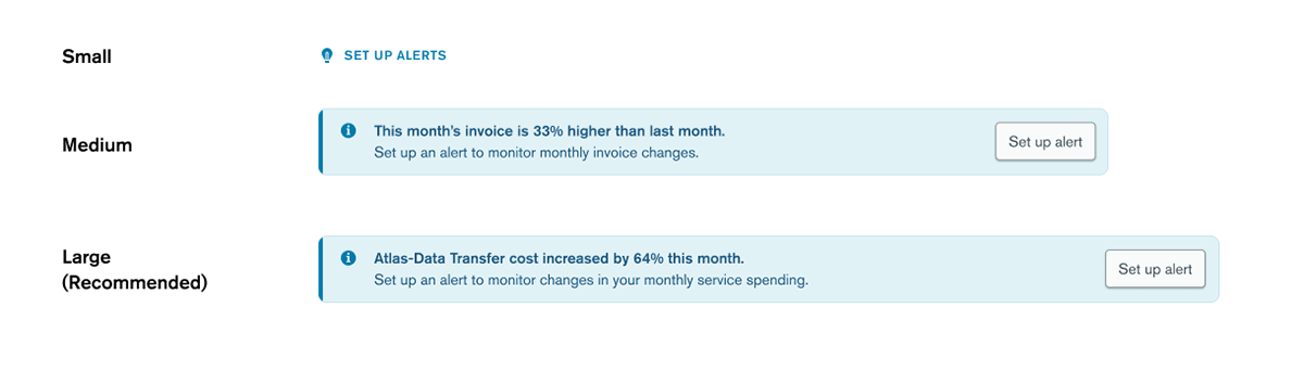
After discussing with the product manager and fellow designers, I chose to move forward with the banner option as it called more attention than the link and tooltip, while still having the ability to be placed within existing card content, unlike the card option. Then, I explored iterations of the banner component focusing on varying its three main visual components:
- Icon
- Color
- Call to action (CTA)
Validating my designs.
With these narrowed-down options, I wanted to see which resonated with users most. To do this, I conducted 8 unmoderated user tests using usertesting.com.
1. Users prefer context for alerts.
7 out of 8 users were unfamiliar with alerts. Yet, after users interacted with the alert option with extra context (through both text and placement), they understood the value proposition of alerts clearly: to monitor changes in spending.
2. Users like visual design that stands out.
Visual design that stands out makes the alert easier to find. 75% of users preferred the blue banner option because the blue color stood on the page, but not too much like the purple color. They appreciated the call-to-action button as it "told [them] exactly what to do next." Since many users were unfamiliar with alerts, the extra context in the header of the banner, as opposed to just the subtext, helped them understand why alerts are useful.
A redesign that allows users to be proactive about their spending.
From user research and additional conversations with the MongoDB design team, I was able to finalize my design proposal for billing alerts. By placing the link for setting up alerts close to alert-worthy information in the billing interface, and by designing a more friendly, eye-catching link, more users will be able to use billing alerts to proactively monitor their spending.
What I learned
Experimenting with design
With a more exploratory project that had few limitations, I got to experiment with the visual design of the alerts and break away from the design system a bit.
Understand your users
Doing user research was really helpful in understanding what users truly want and what really matters to them.
Unmoderated user testing
This was my first time doing unmoderated user testing and I realized just how much more context I need to include in my prototype when I can't interview users directly.