Color Writing on Kindle
Summary
I owned the design for the color writing and annotation experience for Kindle Scribe's debut e-ink color display.
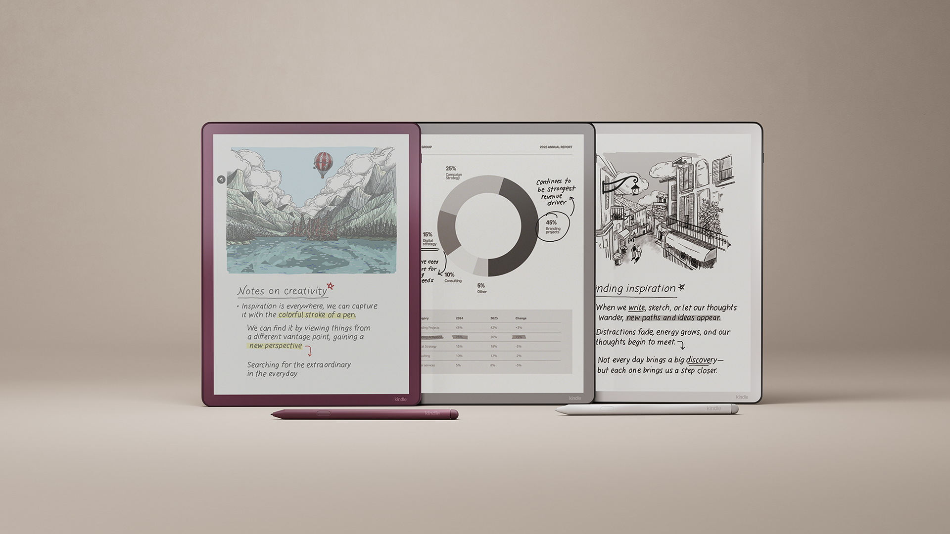
Kindle's first color writing device.
Kindle Color Scribe introduces color as a new medium for annotation, writing, and organization. I had an opportunity to define what color means on a device built around focus and simplicity: enabling richer ways to highlight, write, and structure ideas without compromising the calm, immersive reading experience Kindle is known for. This required designing a cohesive color system that worked seamlessly across annotations, writing tools, bookmarks, and templates, while scaling across devices and preserving ease of use.
How might we introduce powerful color writing tools while still preserving the flow of deep reading and writing?
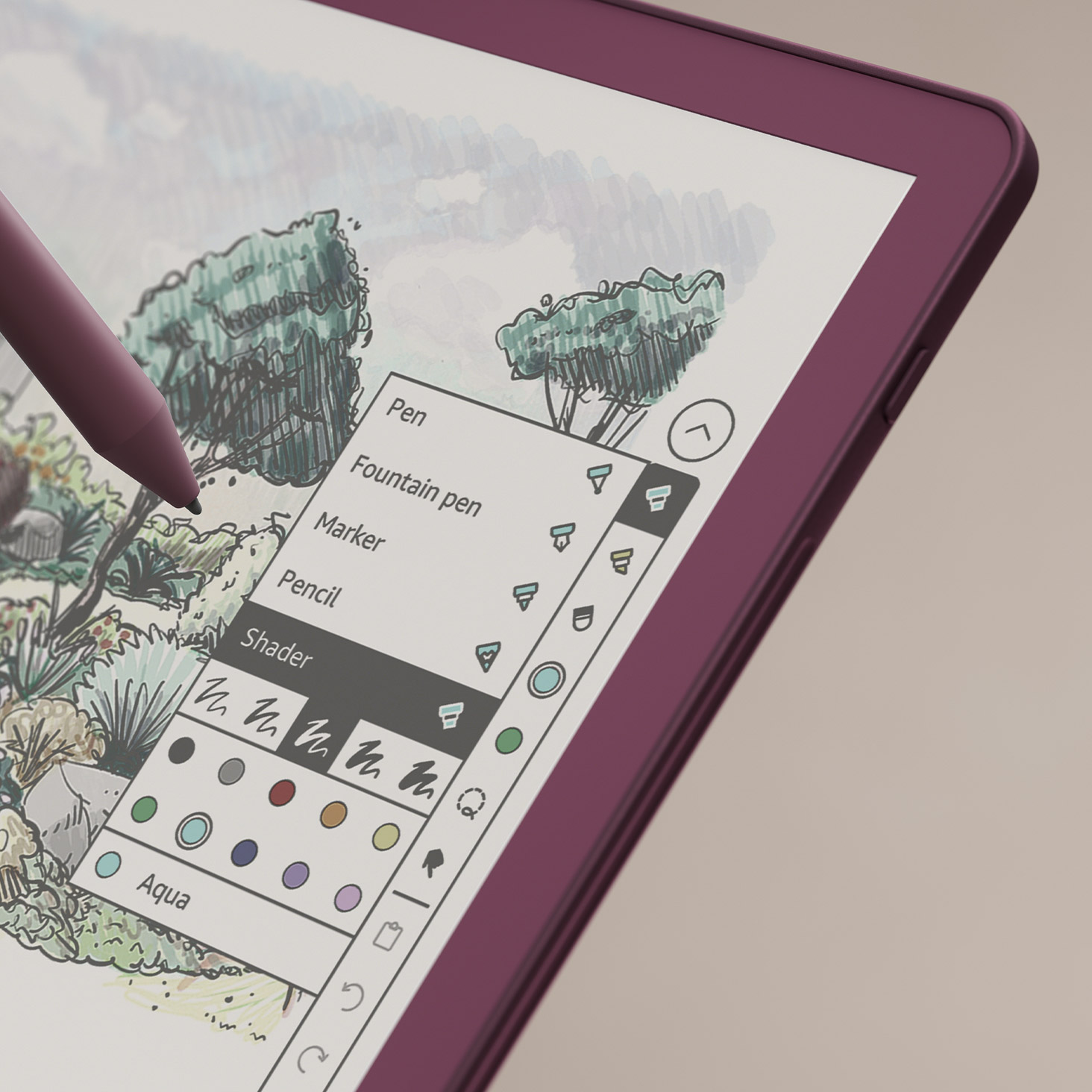
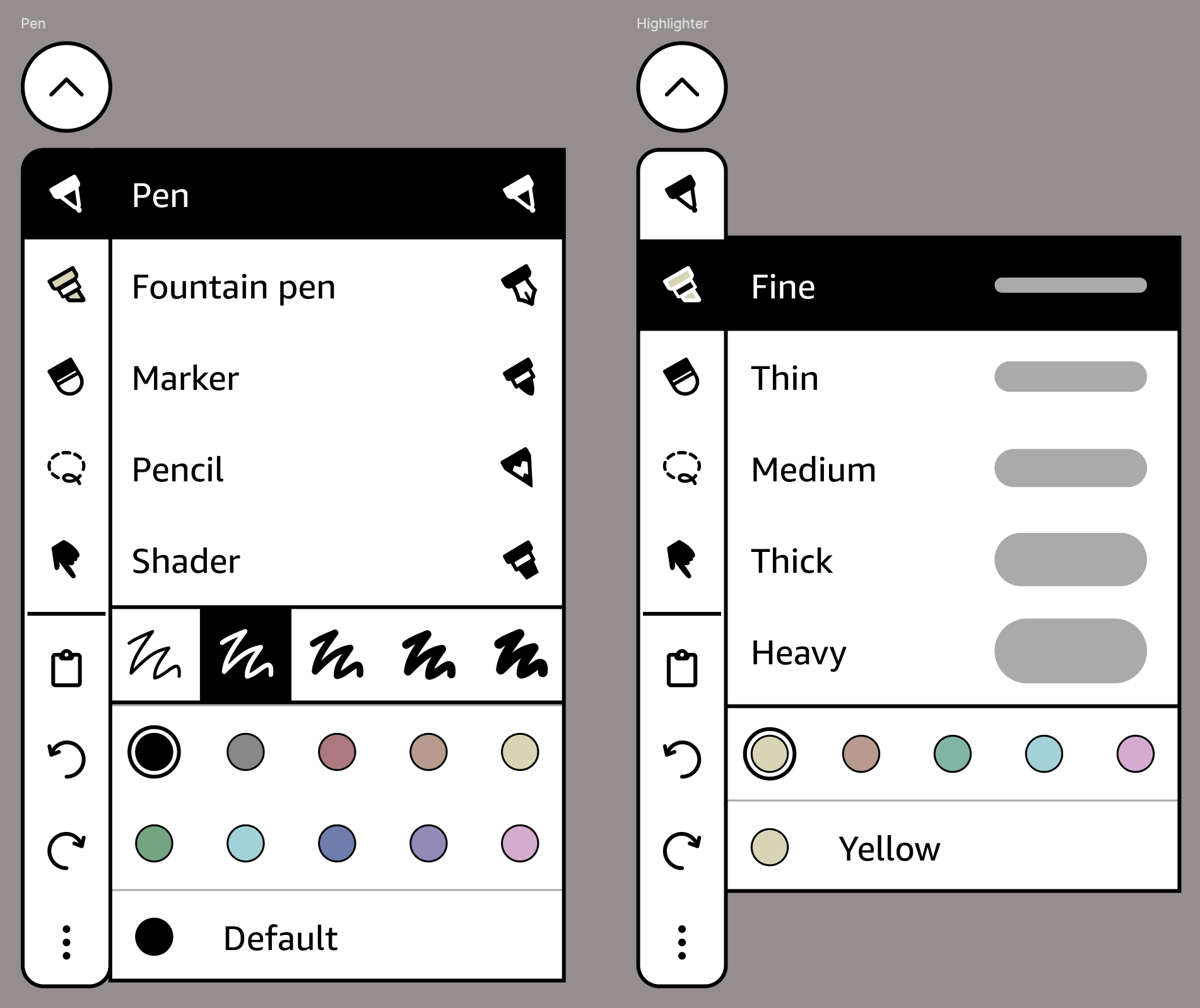
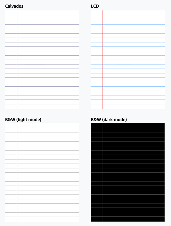
Writing that feels just like pen and paper (with some digital upgrades).
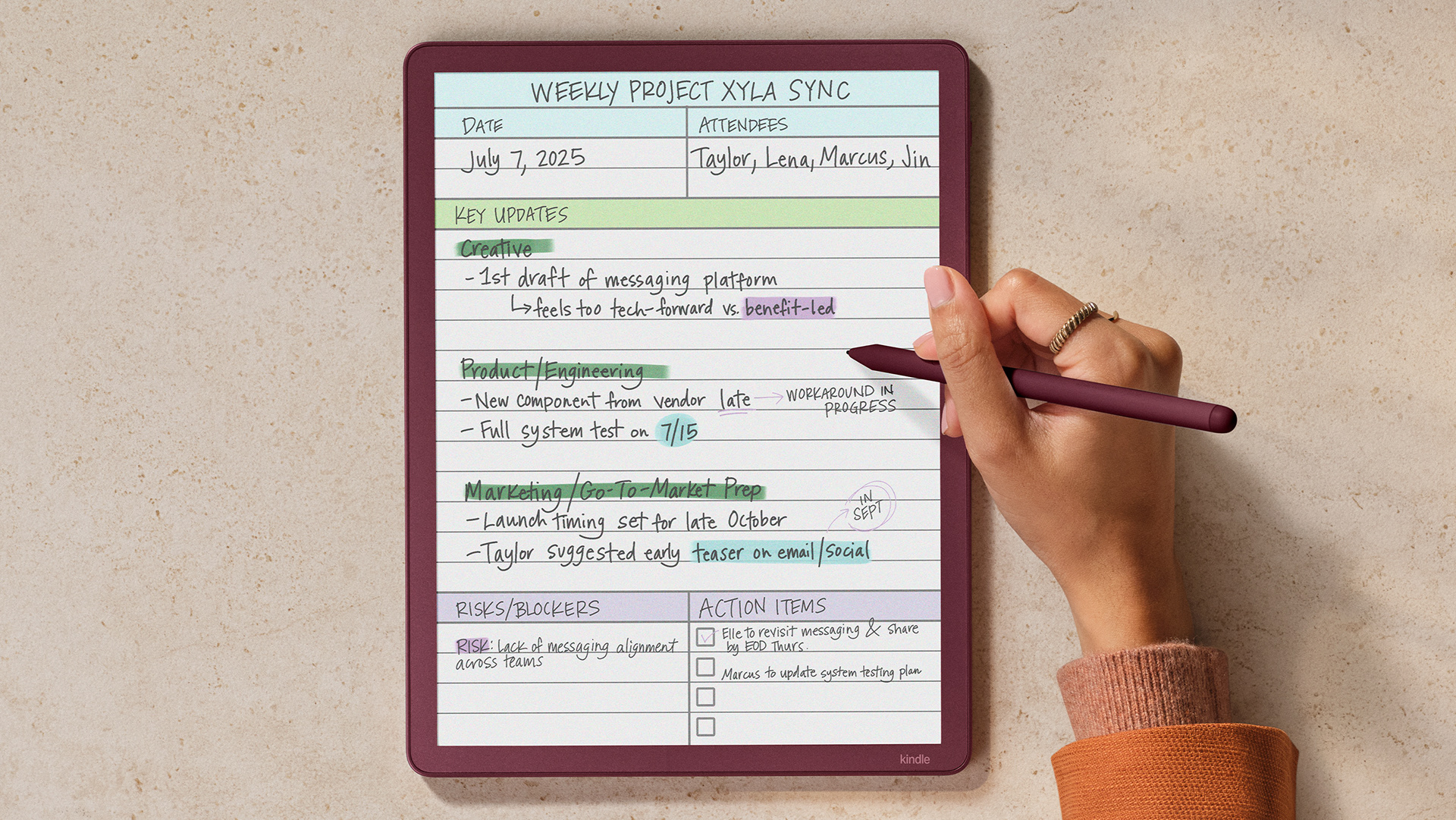
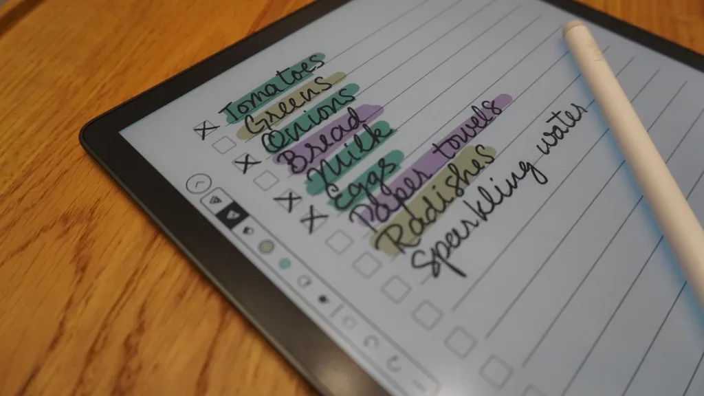
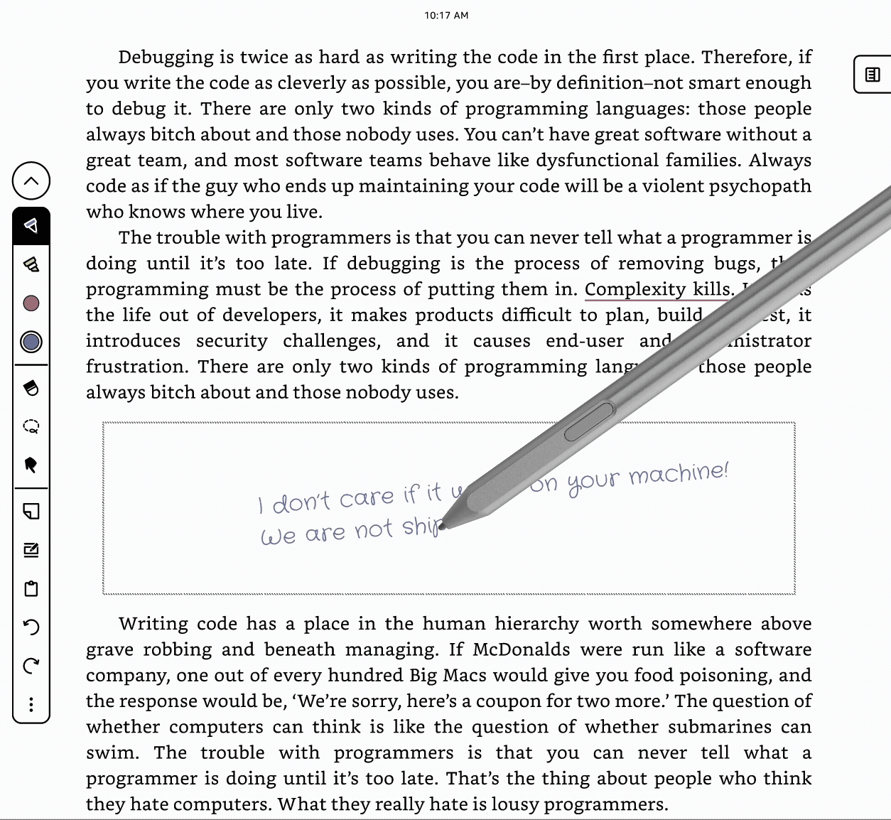
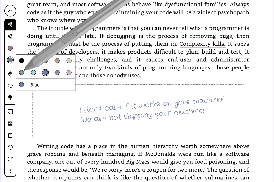
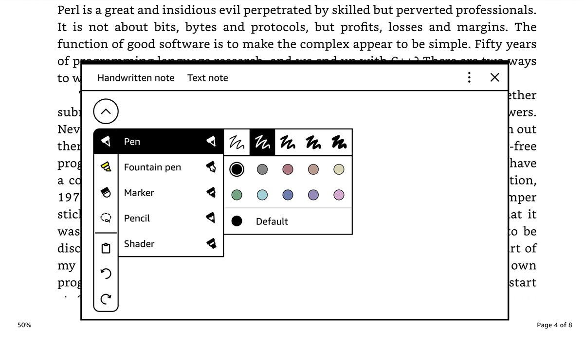
Transform your ideas with color writing tools designed to feel as fluid and responsive as writing on paper. Configurable color slots in the writing toolbar enable one-tap switching between your most-used colors, while lasso select helps you make quick bulk color adjustments, keeping your focus on writing, not menus.
A powerful annotation experience that keeps you organized.
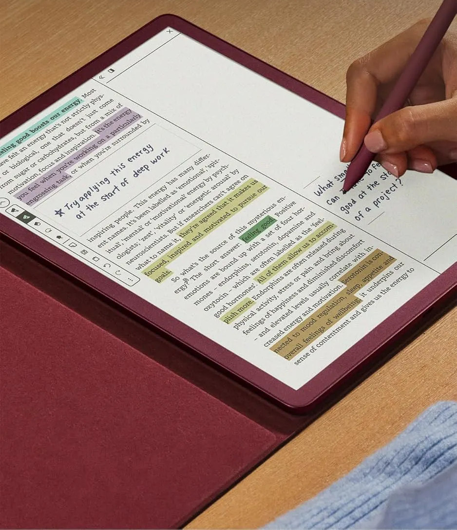
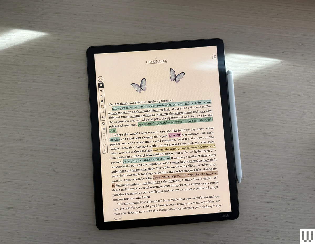
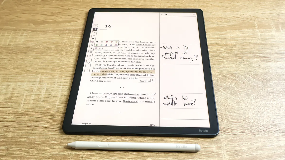
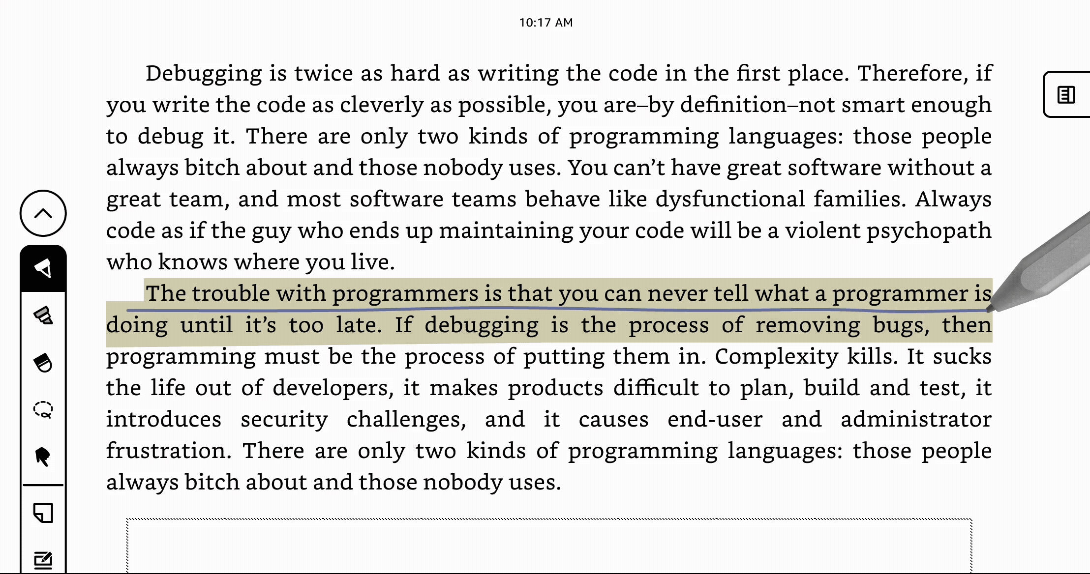
Highlight, underline, and annotate your favorite books in color to keep your thoughts organized and easy to revisit. A redesigned Contextual Action Bar (CAB) helps you edit multi-colored annotations with ease, while color and date filters let you quickly find what matters most. Bookmarks are supercharged with color for more organization and managing them requires just a couple taps.
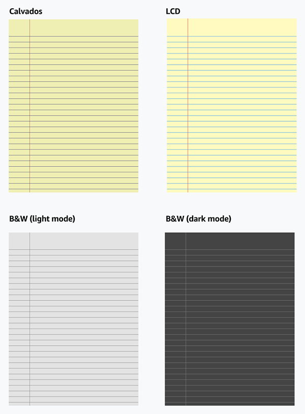
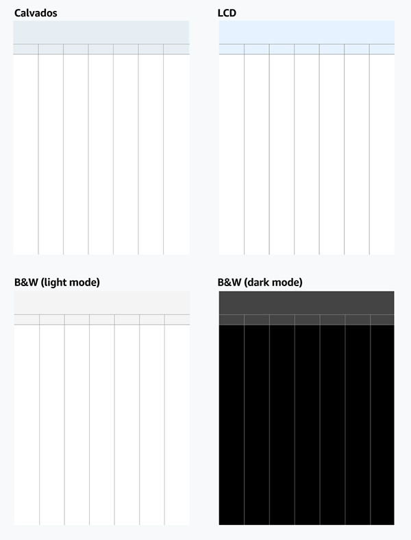
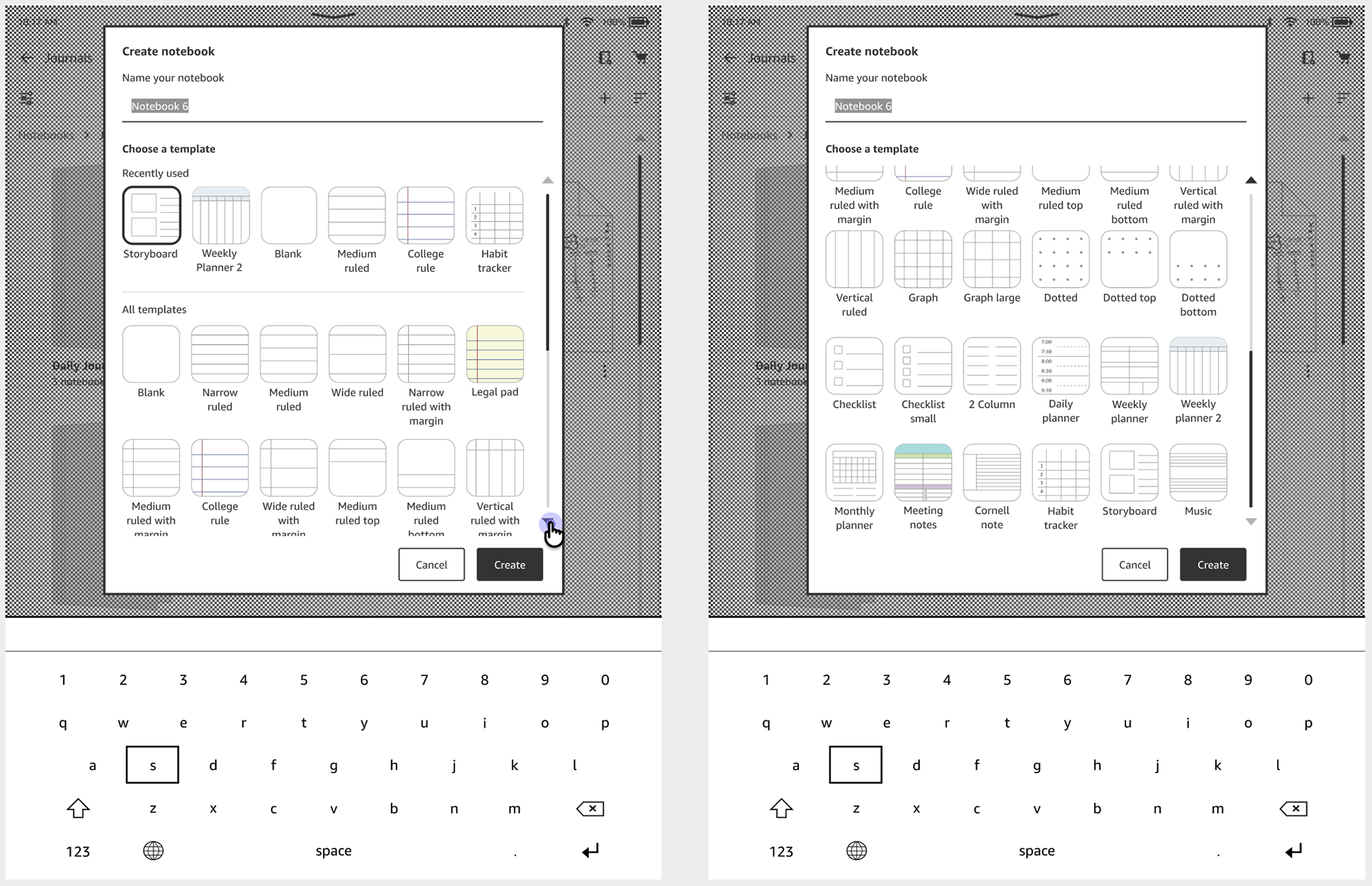
Jumpstart your thinking with carefully curated templates.
Structure your ideas with an expanded template library designed for simplicity and versatility—whether you're a student, professional, or journaler. A redesigned template picker surfaces your most recently used templates first, helping you get started faster.
A color writing experience that turns color into a natural extension of thinking, not a distraction from it.
Impact.
The Kindle Scribe Colorsoft became available to purchase December 10, 2025. Here are some things people have been saying about it!
"Smooth writing feel. Easy to use. Color version adds a lot of fun for annotators who want to highlight books or take color-coded notes."
— Wired
"The writing and sketching experience is excellent. The screen responds instantly to the stylus, putting down lines just as if it were ink on paper…Taking notes is simple and easy."
— PCMag
"The software stays out of the way, which makes the device feel like a natural landing place for ideas...Color e-ink is still a compromise, but highlighting in actual yellow or annotating in red or blue makes margin notes feel more intentional."
— Inc.
"Taking notes and highlighting passages (in color) while reading was a feature that I didn't know I wanted or needed."
— Good Housekeeping
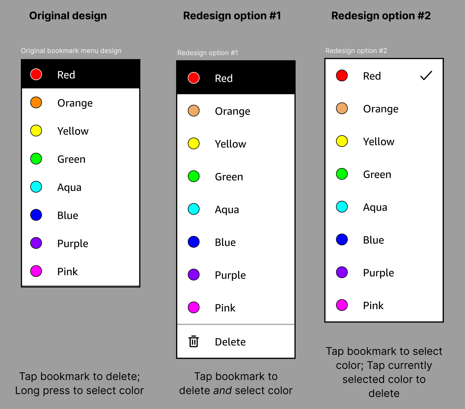
Adding color to annotations.
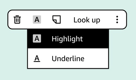
Annotations are a core Kindle interaction, so the in-book contextual action bar (CAB) had to feel almost invisible—powerful when needed, effortless when not. The challenge was fitting significantly more functionality (multiple annotation types and colors) into a space that was already constrained and frequently used. My goal was to minimize cognitive load while preserving fast, one-tap access to the most common actions, allowing readers to annotate and immediately return to reading.
Iterating.
Early explorations tested multiple interaction models, including toggles, nested menus, and explicit delete actions. As complexity increased—especially once we discovered that highlights and underlines could coexist—I used design crits and usability principles to pressure-test each option. Designs that technically "worked" were often eliminated because they required too much scanning, too many decisions, or broke reading flow. This helped narrow the direction toward fewer visible actions with richer, context-specific submenus.
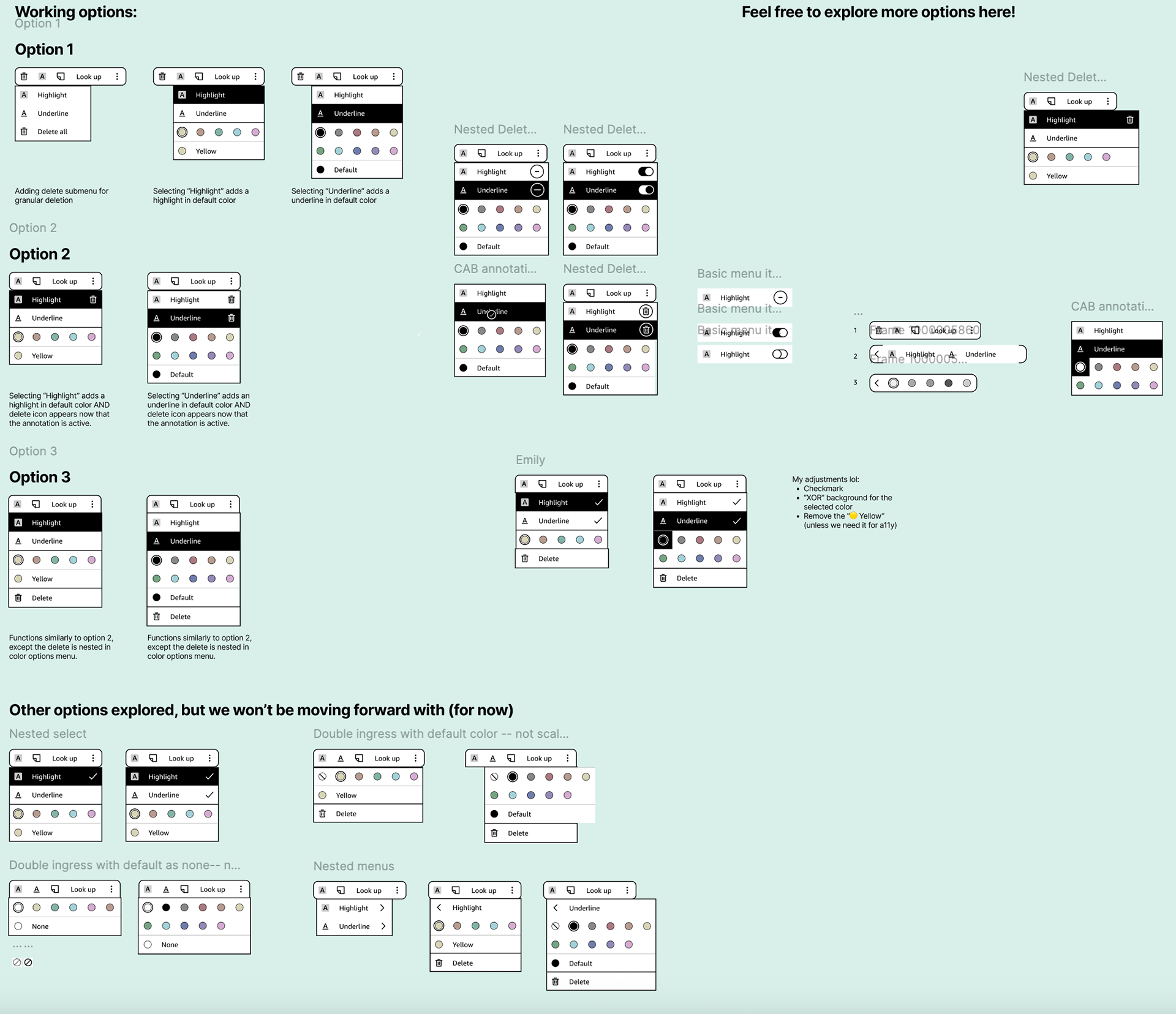
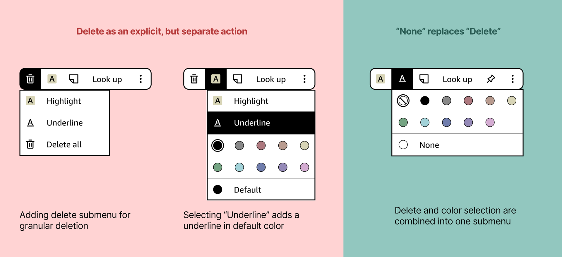
Simplifying the menu.
One of the most important decisions was removing the explicit delete action from the main CAB and folding it into a "None" option within the color submenu. This reframed deletion as part of editing, not a separate mode, and significantly reduced visual noise. Similarly, highlight and underline were kept as first-class actions in the main CAB rather than being nested, making annotation types immediately scannable and reducing mental parsing time—despite concerns about long-term future-proofing. I aligned stakeholders on prioritizing clarity for today's core use cases, with a clear strategy for scaling later if new annotation types are introduced.
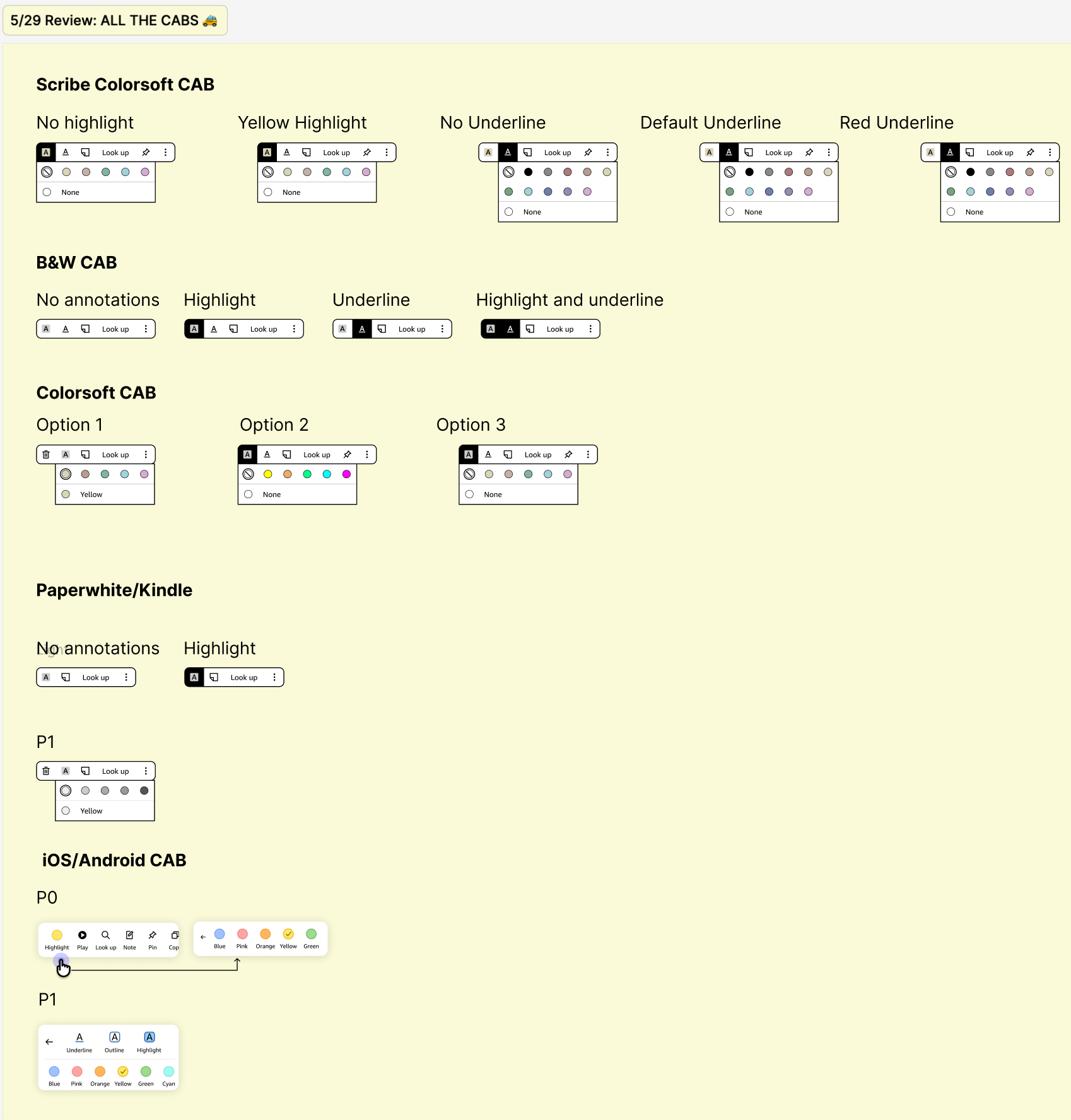
Designing cross-surface.
The CAB needed to flex across color and black-and-white devices, as well as platforms with different technical constraints. Rather than enforcing strict uniformity, I advocated for surface-appropriate designs that preserved the same mental model while adapting interaction patterns (e.g., toggles on B&W devices without color options). This added engineering complexity, but resulted in a simpler, more intuitive experience for each user group—a tradeoff I worked closely with PM and engineering partners to justify.
A powerful annotation experience that stays out of the way.
The redesigned Contextual Action Bar (CAB) enables fast, flexible annotation—supporting highlights and underlines in multiple colors—without interrupting reading flow. By surfacing the right actions at the right time and adapting across Kindle surfaces, the final design balances power and simplicity for one of the most core Kindle interactions. While we didn't have a single success metric for this feature, annotations were not flagged as a pain point during beta or launch, and CSAT scores from internal beta testing for color highlights and underlines were strong (6.14/7). Most importantly, users were able to access powerful annotation tools without breaking immersion—validating the core design goal.
Identifying friction when switching colors.
User research and beta feedback consistently surfaced color switching as a pain point in the writing experience. While the existing color submenu worked functionally, it interrupted flow—especially for users who alternate frequently between a small set of colors. Research showed that most customers typically use only two or three colors in a session, which created an opportunity to optimize for speed without over-engineering.
Exploring solutions and evaluating tradeoffs.
I explored three primary directions:
- Color slots offered the fastest switching with minimal cognitive load once learned, but required careful toolbar space management.
- Pen presets bundled tool type and color together, but introduced setup complexity and reduced flexibility mid-session.
- Floating palettes were the most immediately discoverable but covered writing space and introduced significant technical overhead.
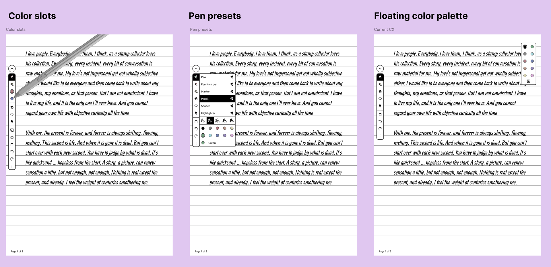
Validating our solution.
Through discussion and a focused design sprint with PM, engineering, and design, we aligned on color slots as the best balance of speed, simplicity, and feasibility—especially given late-stage timing. Internal beta results validated this approach: the writing experience achieved a customer satisfaction score of 6.10/7, with over 80% of testers rating pen color controls as easy or very easy to use. Importantly, users reported that writing in color felt just as fluid as black ink—confirming that we added expressive power without compromising performance or feel.
Designing for scalability.
Because the writing toolbar appears in multiple contexts, including constrained surfaces like sticky notes, the solution needed to scale. Color slots were intentionally designed as shortcuts rather than required tools, allowing them to be removed in space-limited views without breaking core functionality. This ensured the feature enhanced power users' workflows while preserving a clean baseline experience for the majority of users.
Templates: Grounding a subjective feature in research.
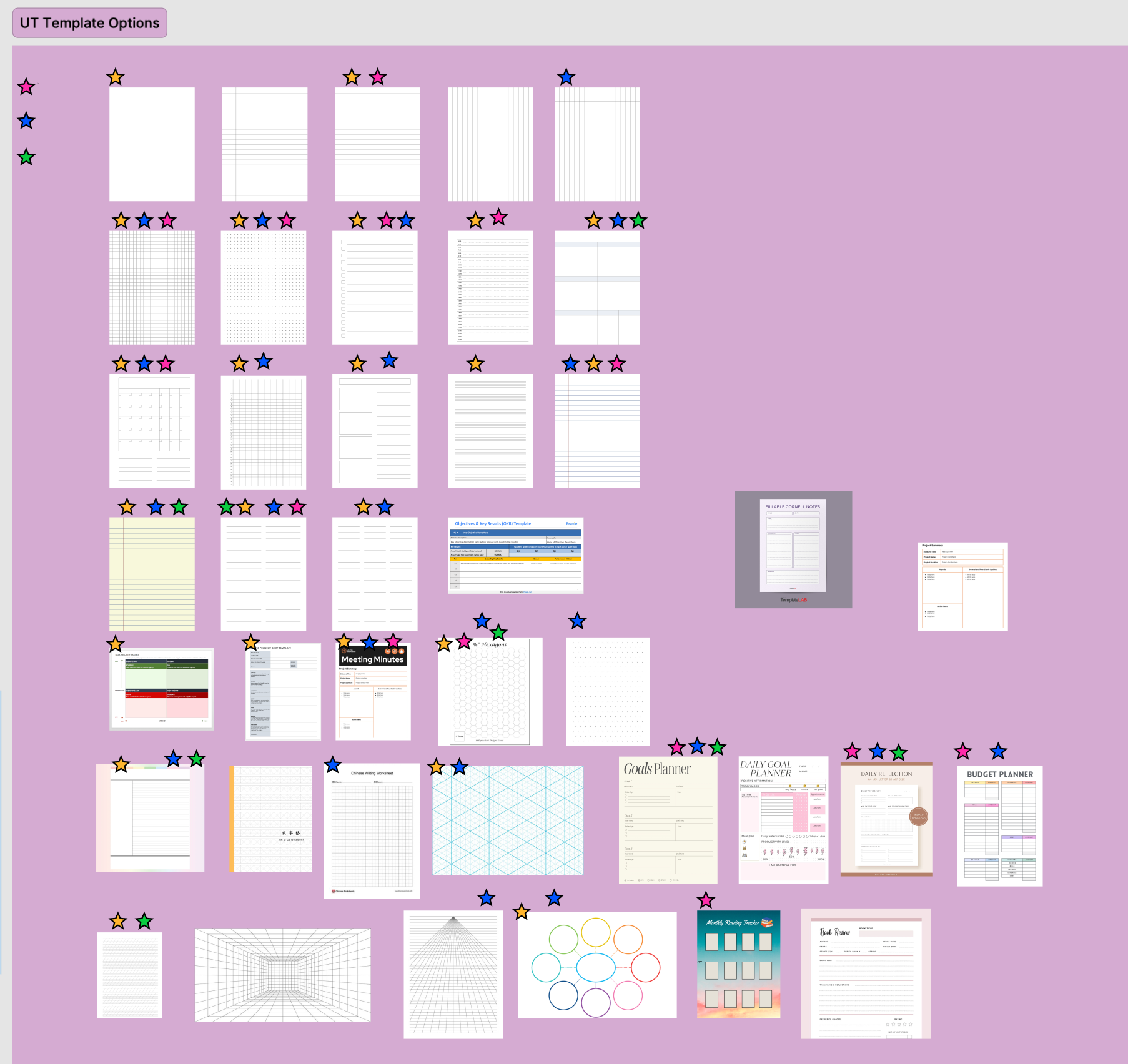
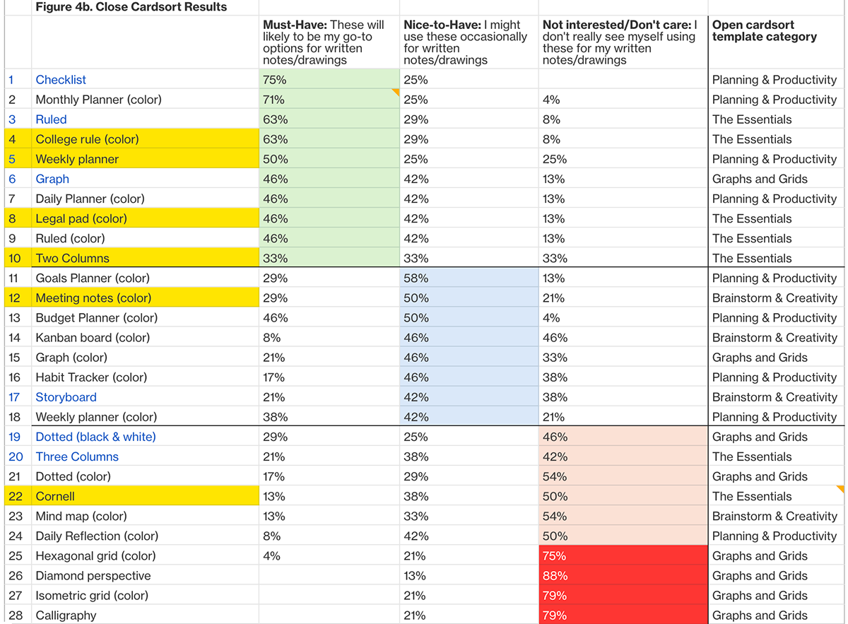
Templates are inherently personal, so rather than designing from taste or intuition, I partnered closely with the Kindle UX Research team to anchor decisions in user input. I compiled a longlist of potential templates informed by competitive analysis, existing Kindle usage, and student, professional, and reading-adjacent workflows. Users then ranked templates by likelihood of use and shared qualitative feedback on what made templates valuable—or distracting.
What users actually wanted (and didn't).
Research revealed a clear pattern: users favored simple, versatile templates that supported many use cases over highly decorative or niche designs. Contrary to internal pressure to introduce more color, users consistently preferred black-and-white templates, citing reduced distraction and better focus on handwritten content. Customizability emerged as the strongest unmet need, reinforcing that templates should act as flexible scaffolding rather than prescriptive layouts.
Designing within technical constraints.
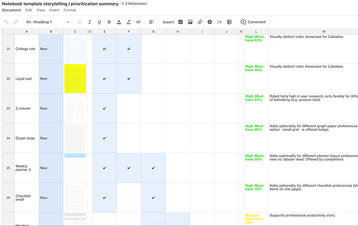
Based on these insights, we added 12 new, top-ranked templates, complemented by a small set of familiar colored options (e.g., college ruled, legal pad). Due to technical constraints—templates being static SVGs without localization support—we couldn't offer manual spacing or sizing controls. Instead, I designed multiple variations of existing templates to approximate customization and ensure usefulness across workflows. I also worked closely with engineering to ensure colored templates were backward compatible across black-and-white devices and Kindle apps on iOS and Android.
Making 30 templates feel manageable.
As the template library grew, discoverability became the next challenge. I explored sorting, tabs, and filters, but each added interaction cost and technical complexity.
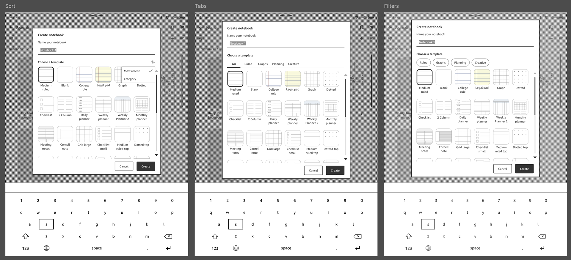
The final solution—a "recently used" row at the top of the picker—optimized for speed and learnability without requiring extra taps or UI chrome. This approach aligned with real usage patterns and fit cleanly within the limited picker space. We were able to validate this solution in internal beta testing, where the highest rating within the Notebook CX was for creating notebooks with templates (93%), which users reported as "intuitive".
Adapting to device constraints.
After many design/leadership reviews and handing off the final specs to engineering, we still had to adapt designs because of newly-discovered technical constraints. A key example of this was with color bookmarks. While our early design relied on long-press to reveal color options, device-level grip suppression on screen edges blocked this interaction. I pivoted the design to move delete into the color submenu, aligning with existing Kindle app patterns and avoiding hidden gestures. Constraints like this required flexibility without compromising clarity or learnability.
Launch.
After internal beta testing, many bug-bashes, and final leadership reviews, the Kindle Scribe Colorsoft became available to order and ship on Amazon.com on December 10, 2025 (just in time for the holidays!).
What's next.
Post-launch, we're still working on delivering some features through post-launch software updates to improve the experience. Once we're finished delivering this, our goal is to continue user testing to identify areas where users might be struggling to use or underutilizing a tool.
What I learned.
Designing Kindle's first color writing device pushed me to define new interaction patterns and earn user trust while introducing color tools to a traditionally grayscale product. Working across surfaces deepened my systems thinking and forced me to become intentional about when to unify experiences across surfaces versus allowing divergence to best serve each context. Nearly every feature required tradeoffs—like showing versus hiding overlapping bookmarks or decorative versus utilitarian templates—which I navigated through design critiques, focused sprints, and documented rationale grounded in research and competitive analysis.
Many features evolved rapidly as technical constraints surfaced or beta milestones approached, requiring me to spin up specs, decks, and reviews while validating direction and iterating as new information surfaced. A recurring theme throughout the project was reducing cognitive load and preserving flow in high-speed interactions. I focused on surfacing intent-driven actions while hiding complexity behind context-aware submenus, and I learned to treat technical constraints—like grip suppression disabling long press actions—as design inputs, adapting solutions to remain intuitive and user-centered.